ActionSheet 动作面板
介绍
底部弹起的模态面板,包含与当前情境相关的多个选项。
TIP
阅读该组件文档前请确保已认真阅读快速上手章节的每一个字。
引入
ts
import { IBestActionSheet } from "@ibestservices/ibest-ui";代码演示
基础用法

点我查看代码
ts
@Entry
@Component
struct DemoPage {
  build() {
    Column(){
      IBestButton({
        text: '基础用法',
        onBtnClick: () => {
          IBestActionSheet.show({
            actions: ["选项一", "选项二", "选项三"],
            onSelect: (index: number, name?: string | number) => {
              IBestToast.show(`点击了第${index}个选项,名称为${name}`)
            },
            beforeClose: () => {
              return new Promise((resolve, reject) => {
                IBestDialogUtil.open({
                  title: "提示",
                  message: "确定关闭?",
                  showCancelButton: true,
                  onConfirm: () => {
                    resolve(true)
                  },
                  onCancel: () => {
                    reject(false)
                  }
                })
              })
            }
          })
        }
      })
    }
  }
}
展示图标
点我查看代码
ts
@Entry
@Component
struct DemoPage {
  build() {
    Column(){
      IBestButton({
        text: '展示图标',
        onBtnClick: () => {
          IBestActionSheet.show({
            actions: [
              { name: '选项一', icon: $r("app.media.icon_like") },
              { name: '选项二', icon: "https://ibestui.ibestservices.com/favicon.ico" },
              { name: '选项三', icon: $r("app.media.icon_star_o") }
            ],
            onSelect: (index: number, name?: string | number) => {
              IBestToast.show(`点击了第${index}个选项,名称为${name}`)
            }
          })
        }
      })
    }
  }
}
展示取消按钮

点我查看代码
ts
@Entry
@Component
struct DemoPage {
  build() {
    Column(){
      IBestButton({
        text: '展示取消按钮',
        onBtnClick: () => {
          IBestActionSheet.show({
            actions: [
              { name: '选项一' },
              { name: '选项二' },
              { name: '选项三' }
            ],
            cancelText: '取消',
            onSelect: (index: number, name?: string | number) => {
              IBestToast.show(`点击了第${index}个选项,名称为${name}`)
            },
            onCancel: () => {
              IBestToast.show(`取消`)
            }
          })
        }
      })
    }
  }
}
展示标题、描述信息
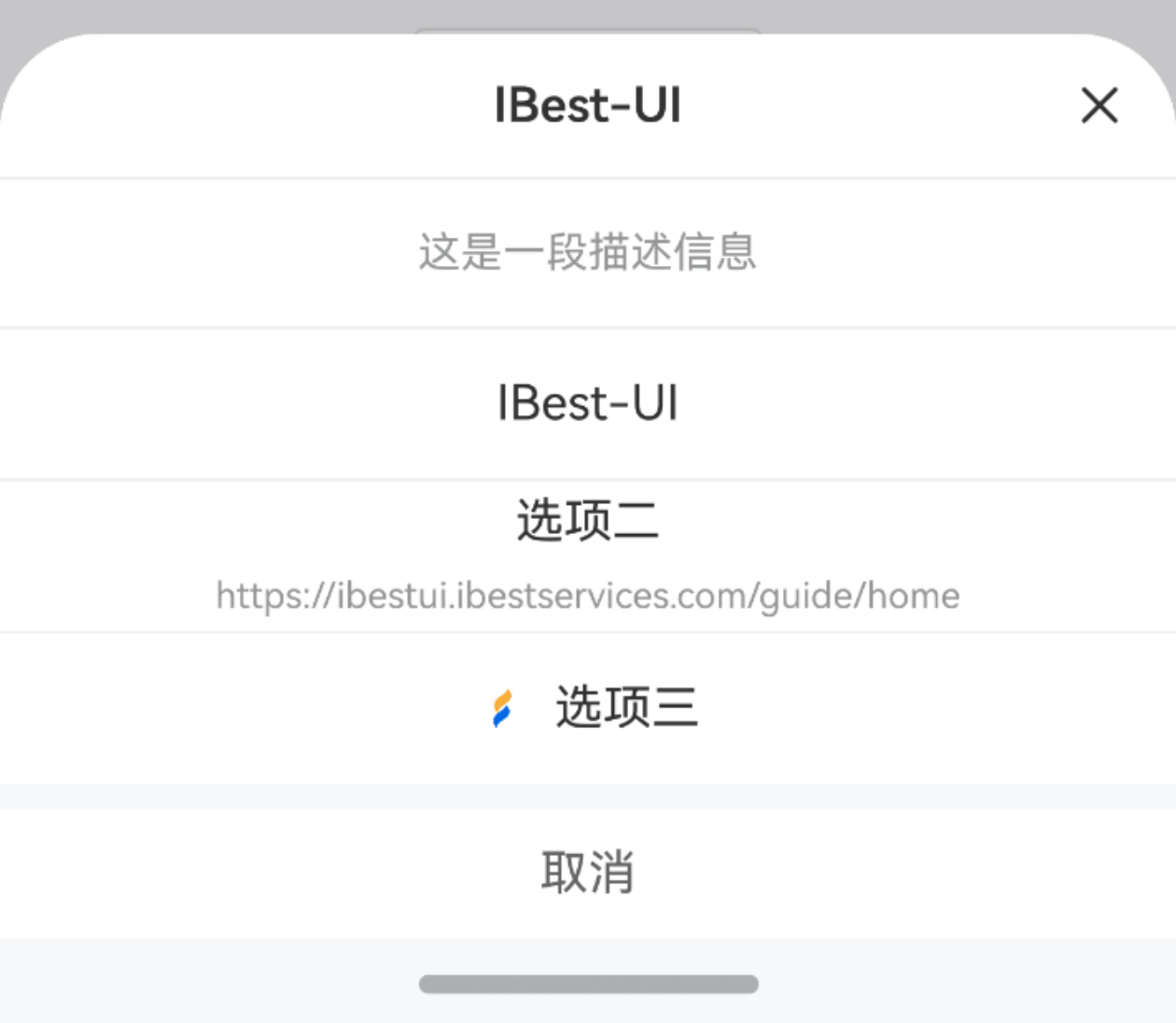
点我查看代码
ts
@Entry
@Component
struct DemoPage {
  build() {
    Column(){
      IBestButton({
        text: '展示标题、描述信息',
        onBtnClick: () => {
          IBestActionSheet.show({
            customTitle: $r("app.string.app_name"),// 替换为自己项目的资源
            description: '这是一段描述信息',
            actions: [
              { name: $r("app.string.app_name") },// 替换为自己项目的资源
              { name: '选项二', subName: $r("app.string.app_doc_url") },// 替换为自己项目的资源
              { name: '选项三', icon: $r("app.media.app_icon") }// 替换为自己项目的资源
            ],
            cancelText: '取消'
          })
        }
      })
    }
  }
}
选项状态

点我查看代码
ts
@Entry
@Component
struct DemoPage {
  build() {
    Column(){
      IBestButton({
        text: '选项状态',
        onBtnClick: () => {
          IBestActionSheet.show({
            description: '这是一段描述信息',
            actions: [
              { name: '选项一', color: '#ff0000' },
              { name: '选项二', isDisabled: true },
              { name: '选项三' }
            ],
            cancelText: '取消'
          })
        }
      })
    }
  }
}
指定选项标识

TIP
通过选项中的 value 属性可指定选项的标识, 此时 onSelect 回调中 第二个参数为当前选中选项的标识。
点我查看代码
ts
@Entry
@Component
struct DemoPage {
  build() {
    Column(){
      IBestButton({
        text: '指定选项标识',
        onBtnClick: () => {
          IBestActionSheet.show({
            actions: [
              { name: '选项一', value: '1' },
              { name: '选项二', value: '2' },
              { name: '选项三', value: '3' }
            ],
            onSelect: (index: number, value?: string | number, name?: string | number) => {
              IBestToast.show(`点击了第${index}个选项,标识为${value},名称为${name}`)
            }
          })
        }
      })
    }
  }
}
多行选项

TIP
通过配置 actions 为二维数组,即可实现多行选项,此时 onSelect 回调中第一个参数表示第几行,第二个参数表示当前行第几个,若配置了 value 属性,第三个参数为当前选中选项的标识。
点我查看代码
ts
@Entry
@Component
struct DemoPage {
  build() {
    Column(){
      IBestButton({
        text: '多行选项',
        onBtnClick: () => {
          IBestActionSheet.show({
            actions: [
              [
                { name: '选项一', value: '1', icon: "https://img1.baidu.com/it/u=626427719,3451396095&fm=253&fmt=auto&app=138&f=JPEG?w=500&h=500", isDisabled: true },
                { name: '选项二', value: '2', icon: "https://img1.baidu.com/it/u=700838104,4078529388&fm=253&fmt=auto&app=138&f=JPEG?w=500&h=500" },
                { name: '选项三', value: '3', icon: "https://img2.baidu.com/it/u=4065465253,912770067&fm=253&fmt=auto&app=120&f=JPEG?w=800&h=800" },
                { name: '选项四', value: '4', icon: "https://img1.baidu.com/it/u=2725751717,2191296050&fm=253&fmt=auto&app=138&f=JPEG?w=500&h=500" },
                { name: '选项五', value: '5', icon: "https://img1.baidu.com/it/u=3680872223,3132467302&fm=253&fmt=auto&app=138&f=JPEG?w=500&h=500" },
                { name: '选项六', value: '6', icon: "https://img2.baidu.com/it/u=2265290985,2435372066&fm=253&fmt=auto&app=138&f=JPEG?w=500&h=500" },
                { name: '选项七', value: '7', icon: "https://img2.baidu.com/it/u=2400134426,605051231&fm=253&fmt=auto&app=138&f=JPEG?w=800&h=800" }
              ],
              [
                { name: '选项八', value: '8', icon: "https://img0.baidu.com/it/u=4206081356,667300244&fm=253&fmt=auto&app=138&f=JPEG?w=500&h=500" },
                { name: '选项九', value: '9', icon: "https://img0.baidu.com/it/u=2290976380,3655879079&fm=253&fmt=auto&app=120&f=JPEG?w=500&h=500" },
                { name: '选项十', value: '10', icon: "https://img0.baidu.com/it/u=1901164914,2143836773&fm=253&fmt=auto&app=120&f=JPEG?w=500&h=500" }
              ]
            ],
            cancelText: '取消',
            onSelect: (index1: number, index2?: number | string, value?: number | string, name?: string | number) => {
              IBestToast.show(`点击了第${index1}行第${index2}个选项,标识为${value},名称为${name}`)
            }
          })
        }
      })
    }
  }
}
展示自定义内容

点我查看代码
ts
@Entry
@Component
struct DemoPage {
  @Builder defaultContent(){
    Scroll(){
      Column({ space: 10 }){
        Text("浔阳江头夜送客,枫叶荻花秋瑟瑟。")
        Text("主人下马客在船,举酒欲饮无管弦。")
        Text("醉不成欢惨将别,别时茫茫江浸月。")
        Text("忽闻水上琵琶声,主人忘归客不发。")
        Text("寻声暗问弹者谁,琵琶声停欲语迟。")
        Text("移船相近邀相见,添酒回灯重开宴。")
        Text("千呼万唤始出来,犹抱琵琶半遮面。")
        Text("转轴拨弦三两声,未成曲调先有情。")
        Text("弦弦掩抑声声思,似诉平生不得志。")
        Text("低眉信手续续弹,说尽心中无限事。")
        Text("轻拢慢捻抹复挑,初为《霓裳》后《六幺》。")
        Text("大弦嘈嘈如急雨,小弦切切如私语")
        Text("嘈嘈切切错杂弹,大珠小珠落玉盘。")
        Text("间关莺语花底滑,幽咽泉流冰下难。")
        Text("冰泉冷涩弦凝绝,凝绝不通声暂歇。")
        Text("别有幽愁暗恨生,此时无声胜有声。")
        Text("银瓶乍破水浆迸,铁骑突出刀枪鸣。")
        Text("曲终收拨当心画,四弦一声如裂帛。")
        Text("东船西舫悄无言,唯见江心秋月白。")
        Text("沉吟放拨插弦中,整顿衣裳起敛容。")
        Text("自言本是京城女,家在虾蟆陵下住。")
        Text("十三学得琵琶成,名属教坊第一部。")
        Text("曲罢曾教善才服,妆成每被秋娘妒。")
        Text("五陵年少争缠头,一曲红绡不知数。")
        Text("钿头银篦击节碎,血色罗裙翻酒污。")
        Text("今年欢笑复明年,秋月春风等闲度。")
        Text("弟走从军阿姨死,暮去朝来颜色故。")
        Text("门前冷落鞍马稀,老大嫁作商人妇。")
        Text("商人重利轻别离,前月浮梁买茶去。")
        Text("去来江口守空船,绕船月明江水寒。")
      }
      .width("100%")
      .alignItems(HorizontalAlign.Center)
      .padding(8)
    }
    .layoutWeight(1)
  }
  build() {
    Column(){
      IBestButton({
        text: '展示自定义内容',
        onBtnClick: () => {
          IBestActionSheet.show({
            customTitle: '琵琶行',
            height: 500,
            customContent: (): void => this.defaultContent()
          })
        }
      })
    }
  }
}
展示原生标题

点我查看代码
ts
@Entry
@Component
struct DemoPage {
  build() {
    Column(){
      IBestButton({
        text: '展示原生标题',
        onBtnClick: () => {
          IBestActionSheet.show({
            title: {
              title: "原生标题",
              subtitle: "原生副标题"
            },
            actions: [
              { name: '选项一' },
              { name: '选项二' },
              { name: '选项三' }
            ],
            cancelText: '取消'
          })
        }
      })
    }
  }
}
API
方法
| 方法名 | 说明 | 参数 | 返回值 |
|---|---|---|---|
| show | 展示, 返回当前弹窗id | option: IBestActionSheetOption | Promise<string> |
| close | 关闭 | id?: string | Promise<void> |
IBestActionSheetOption 数据结构
TIP
部分原生属性会有版本兼容问题,详情可点 这里 查阅官方文档。
| 参数 | 说明 | 类型 | 默认值 |
|---|---|---|---|
| width | 面板宽度, 原生属性 | Dimension | 100% |
| height | 面板高度, 原生属性 | SheetSize | Length | SheetSize.FIT_CONTENT |
| backgroundColor | 半模态页面的背板颜色, 原生属性 | ResourceColor | - |
| detents | 半模态页面的切换高度档位, 原生属性 | [(SheetSize | Length), ( SheetSize | Length)?, (SheetSize | Length)?] | - |
| preferType | 半模态页面的样式, 原生属性 | SheetType | - |
| mode | 设置半模态页面的显示层级, 原生属性 | SheetMode | - |
| dragBar | 是否显示控制条, 原生属性 | boolean | false |
| title | 标题, 原生属性 | SheetTitleOptions | CustomBuilder | - |
| showClose | 是否显示原生关闭图标, 原生属性, 在配置 title 时默认为 true | boolean | false |
| actions | 选项列表 | (IBestActionType | string)[] | (IBestActionMultiLine)[][] | false |
| itemHeight | 选项高度 | string | number | 50 |
| radius | 面板圆角 | number | BorderRadiuses | LocalizedBorderRadiuses | 16 |
| customTitle | 自定义标题 | ResourceStr | '' |
| titleBgColor | 自定义标题背景色 | ResourceColor | #fff |
| description | 描述 | ResourceStr | '' |
| closeable | 是否显示自定义关闭图标 | boolean | true |
| closeIcon | 自定义关闭图标 | ResourceStr | - |
| cancelText | 取消按钮文字 | ResourceStr | '' |
| cancelTextColor | 取消按钮文字颜色 | ResourceColor | #646566 |
| safeAreaInsetBottom | 是否开启底部安全距离适配 | boolean | true |
| closeOnBackPress | 是否允许物理关闭 | boolean | true |
| closeOnClickOverlay | 是否允许点击遮罩关闭 | boolean | true |
| customContent | 自定义内容 | CustomBuilder | - |
| onOpen | 打开面板后触发 | () => void | - |
| onSelect | 选择选项后触发,若传入了beforeClose,则在beforeClose返回true/Promise<true>时触发。当 actions 为一维简单数组或一维对象数组且未指定value时, index1 为选项索引, index2 为选项名称; 当 actions 为一维对象数组且指定value或二维数组时, index1 为点击选项的行索引, index2 为当前行的选项索引, value 为选项标识, name 为选项名称。 | (index1: number, index2?: number | string, value?: string, name?: string) => void | - |
| onCancel | 点击取消按钮触发 | () => void | - |
| onClose | 面板关闭后触发 | () => void | - |
| beforeClose | 仅在选择选项后触发,返回 false 可阻止关闭,支持返回 Promise,回调参数同onSelect | (index1: number, index2?: number | string, value?: string, name?: string) => Promise<boolean> | boolean | - |
| keyboardAvoidMode | 半模态激活输入法时对软键盘的避让方式 | SheetKeyboardAvoidMode | TRANSLATE_AND_RESIZE |
IBestActionType 数据结构
| 参数 | 说明 | 类型 |
|---|---|---|
| name | 选项文案, 必填 | ResourceStr |
| value | 选项标识 | string |
| subName | 选项描述 | ResourceStr |
| color | 选项字体颜色 | ResourceColor |
| icon | 选项图标 | ResourceStr |
| isDisabled | 是否禁用 | boolean |
| readonly | 是否只读 | boolean |
IBestActionMultiLine 数据结构
| 参数 | 说明 | 类型 |
|---|---|---|
| name | 选项文案, 必填 | ResourceStr |
| icon | 选项图标, 必填 | ResourceStr |
| value | 选项标识 | string |
| subName | 选项描述 | ResourceStr |
| color | 选项字体颜色 | ResourceColor |
| isDisabled | 是否禁用 | boolean |
| readonly | 是否只读 | boolean |
主题定制
组件提供了下列颜色变量,可用于自定义深色/浅色模式样式,使用方法请参考 颜色模式 章节,如需要其它颜色变量可提 issue。
| 名称 | 描述 | 默认值 |
|---|---|---|
| ibest_action_sheet_background | 背景颜色 | #f7f8fa |
| ibest_action_sheet_item_background | 选项背景色 | #fff |
| ibest_action_sheet_item_description_color | 描述文字颜色 | #969799 |
| ibest_action_sheet_item_disabled_text_color | 选项禁用时文字颜色 | #c8c9cc |
| ibest_action_sheet_border_color | 边框颜色 | #ebedf0 |