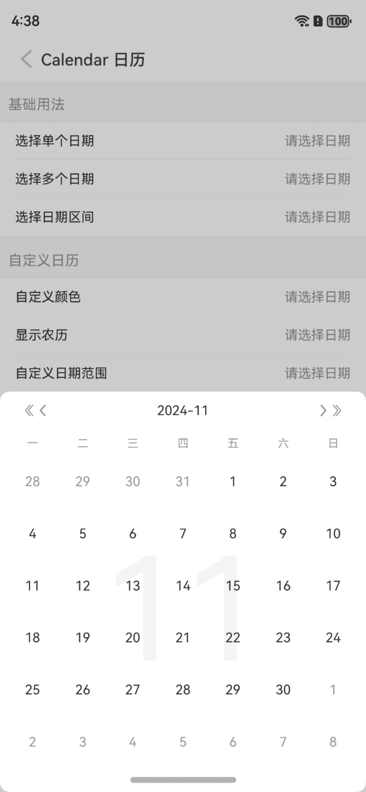
Calendar 日历
介绍
日历用于选择单个、多个日期或日期范围。
TIP
阅读该组件文档前请确保已认真阅读快速上手章节的每一个字。
引入
ts
import { IBestCalendar, IBestCalendarDialog, IBestCalendarConfirmResult } from "@ibestservices/ibest-ui";代码演示
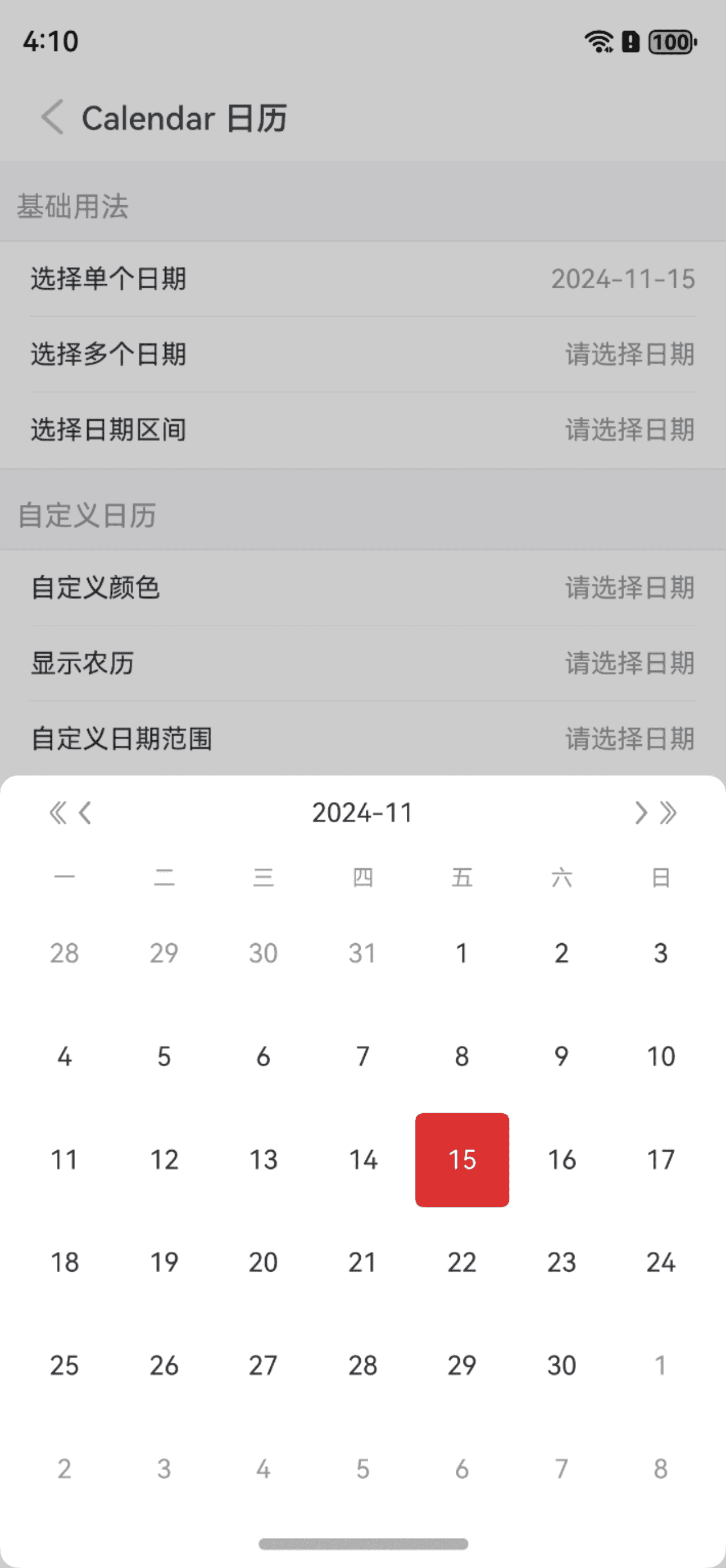
选择单个日期
点我查看代码
ts
@Entry
@Component
struct DemoPage {
  @State visible: boolean = false
  @State selectDate: string = ""
  build() {
    Column(){
      IBestCell({
        title: '选择单个日期',
        value: this.selectDate,
        isLink: true,
        onCellClick: () => {
          this.visible = true
        }
      })
      IBestCalendarDialog({
        visible: $visible,
        value: $selectDate,
        onConfirm: (value: IBestCalendarConfirmResult[]) => {
          IBestToast.show(value[0].dateStr)
        }
      })
    }
  }
}
选择多个日期
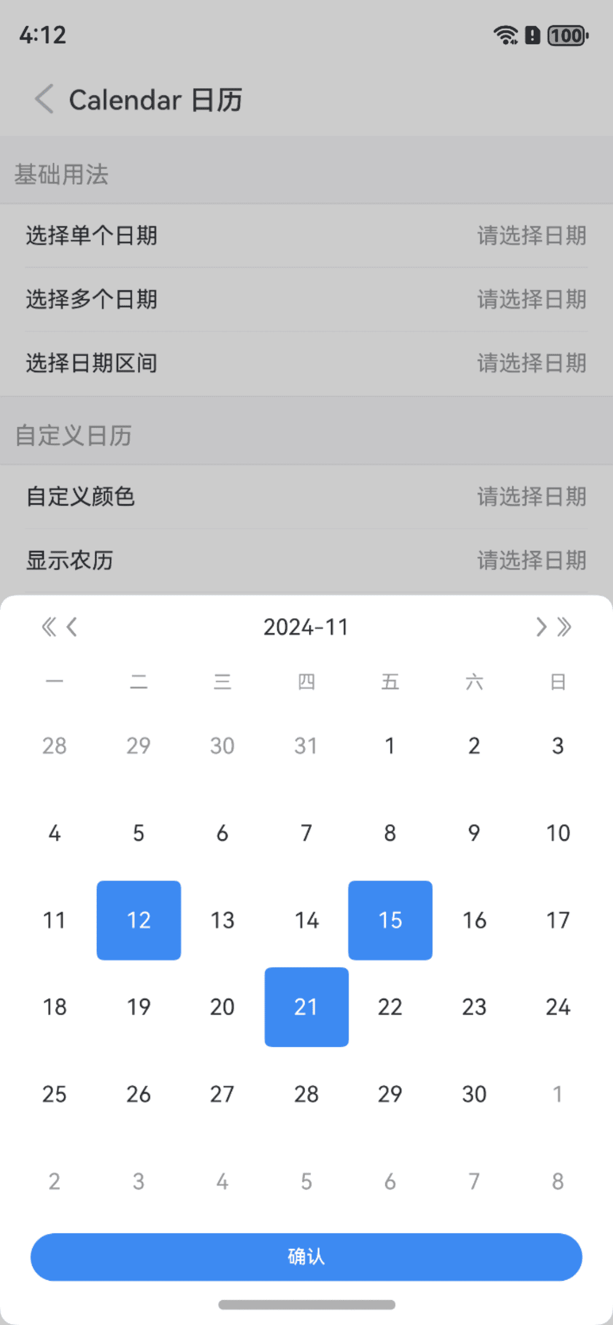
点我查看代码
ts
@Entry
@Component
struct DemoPage {
  @State visible: boolean = false
  @State selectDate: string[] = []
  build() {
    Column(){
      IBestCell({
        title: '选择多个日期',
        value: this.selectDate.join(","),
        isLink: true,
        onCellClick: () => {
          this.visible = true
        }
      })
      IBestCalendarDialog({
        visible: $visible,
        value: $selectDate,
        selectType: "multiple"
      })
    }
  }
}
选择日期区间
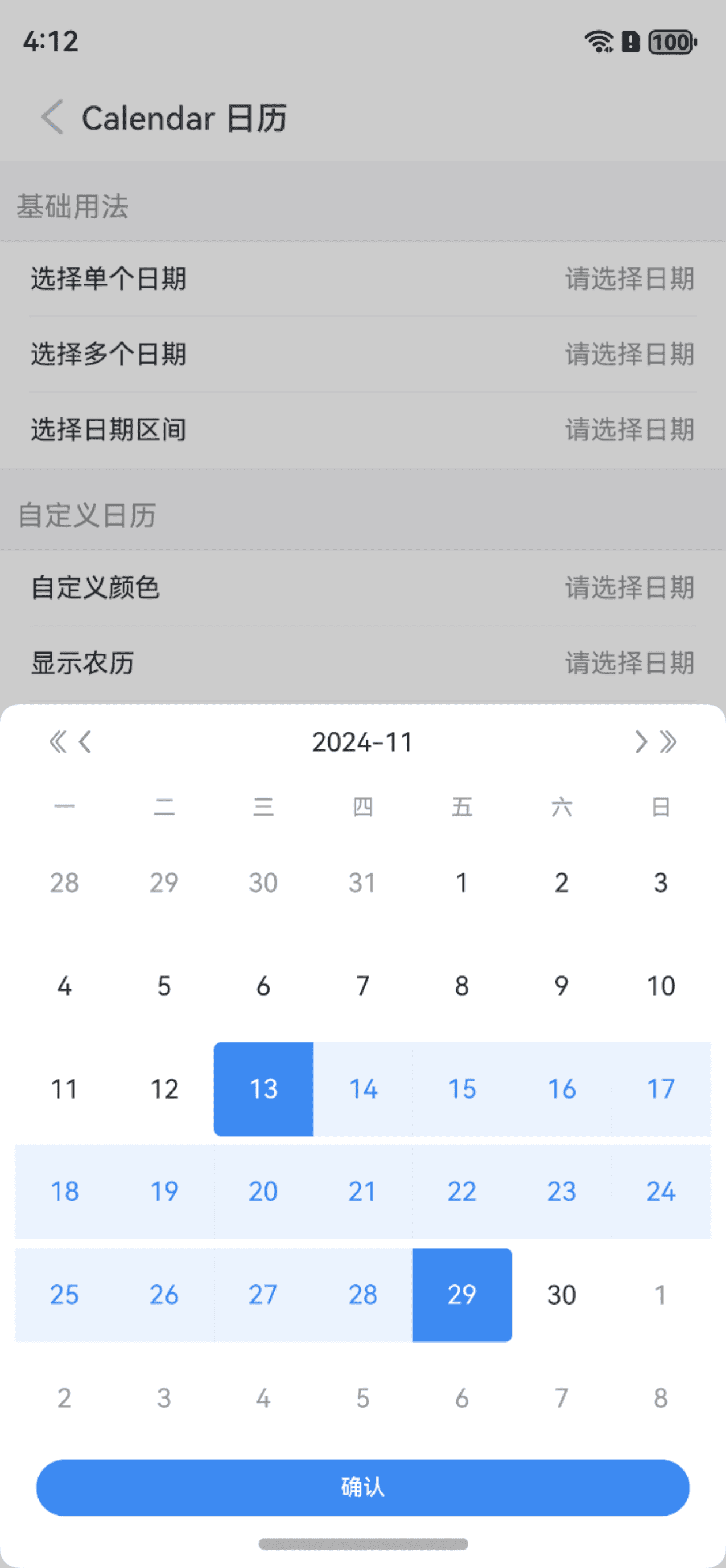
点我查看代码
ts
@Entry
@Component
struct DemoPage {
  @State visible: boolean = false
  @State selectDate: string[] = []
  build() {
    Column(){
      IBestCell({
        title: '选择日期区间',
        value: this.selectDate.length ? this.selectDate[0] + " - " + this.selectDate[this.selectDate.length-1] : "",,
        isLink: true,
        onCellClick: () => {
          this.visible = true
        }
      })
      IBestCalendarDialog({
        visible: $visible,
        value: $selectDate,
        selectType: "range"
      })
    }
  }
}
自定义选中样式
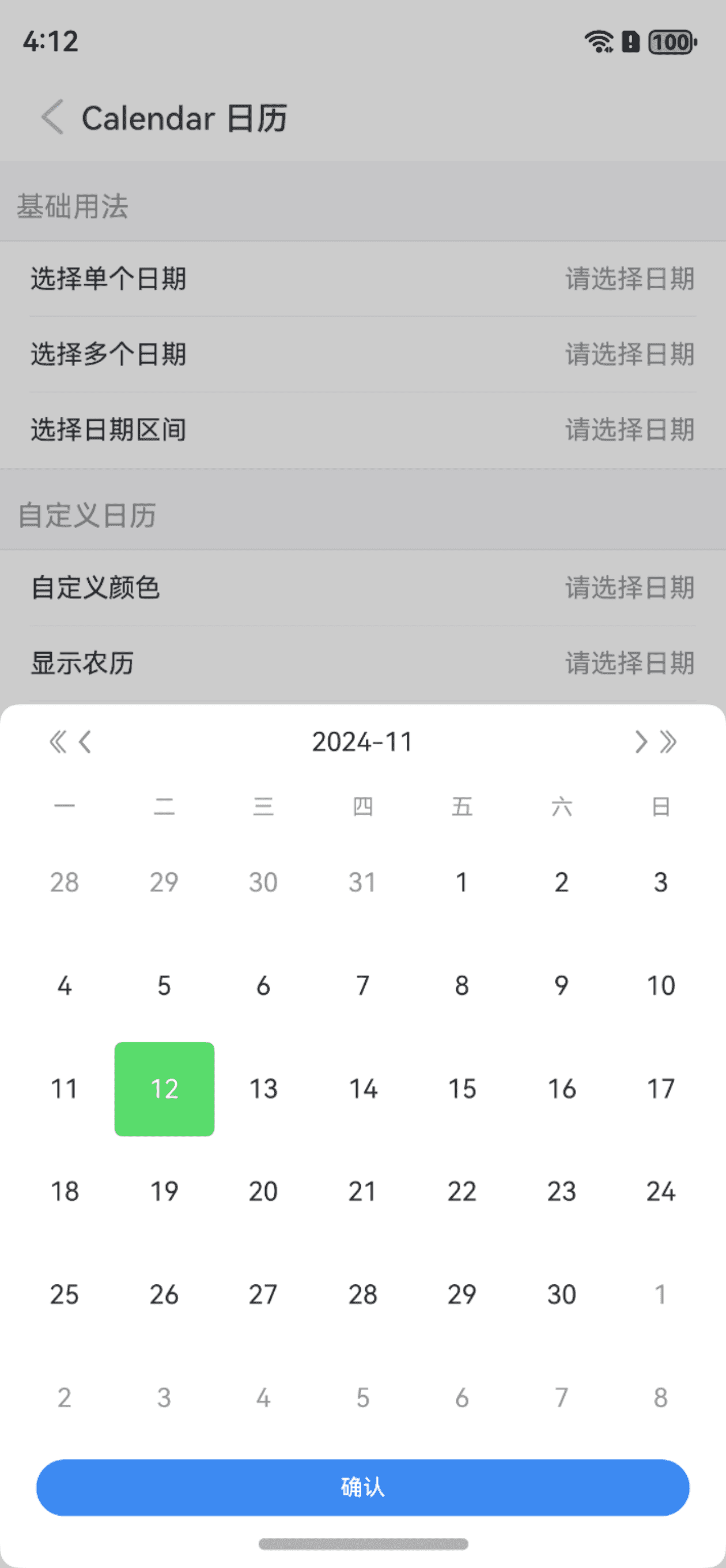
TIP
通过 type 属性可修改选中样式,支持 primary、success、warning、danger 四种选中类型,默认为 primary,也可通过selectedColor属性自定义选中颜色,同时设置时selectedColor优先。
点我查看代码
ts
@Entry
@Component
struct DemoPage {
@State visible: boolean = false
@State selectDate: string = ""
build() {
Column(){
IBestCell({
title: '选择日期',
value: this.selectDate,
isLink: true,
onCellClick: () => {
this.visible = true
}
})
IBestCalendarDialog({
visible: $visible,
value: $selectDate,
type: "danger",
selectedColor: "#58db6b"
})
}
}
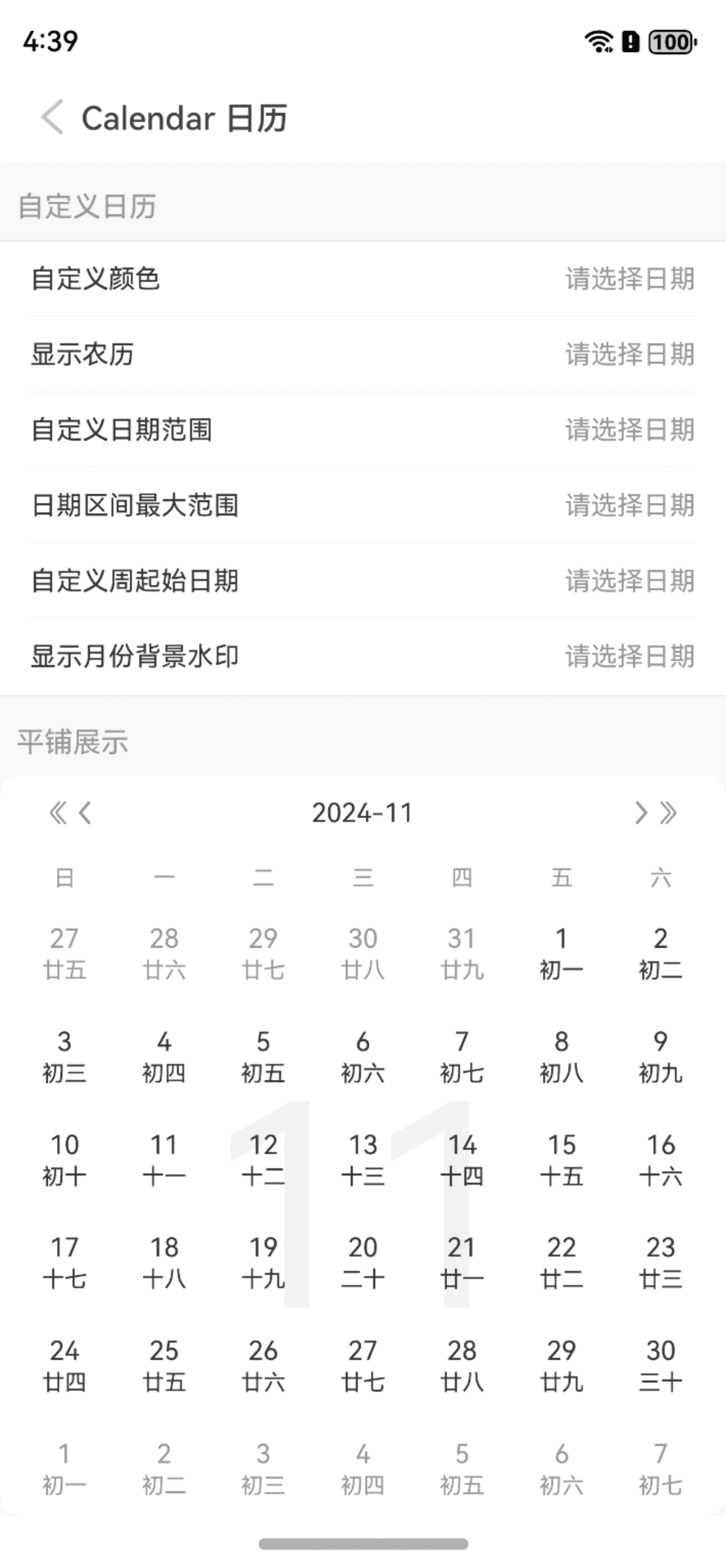
}显示农历
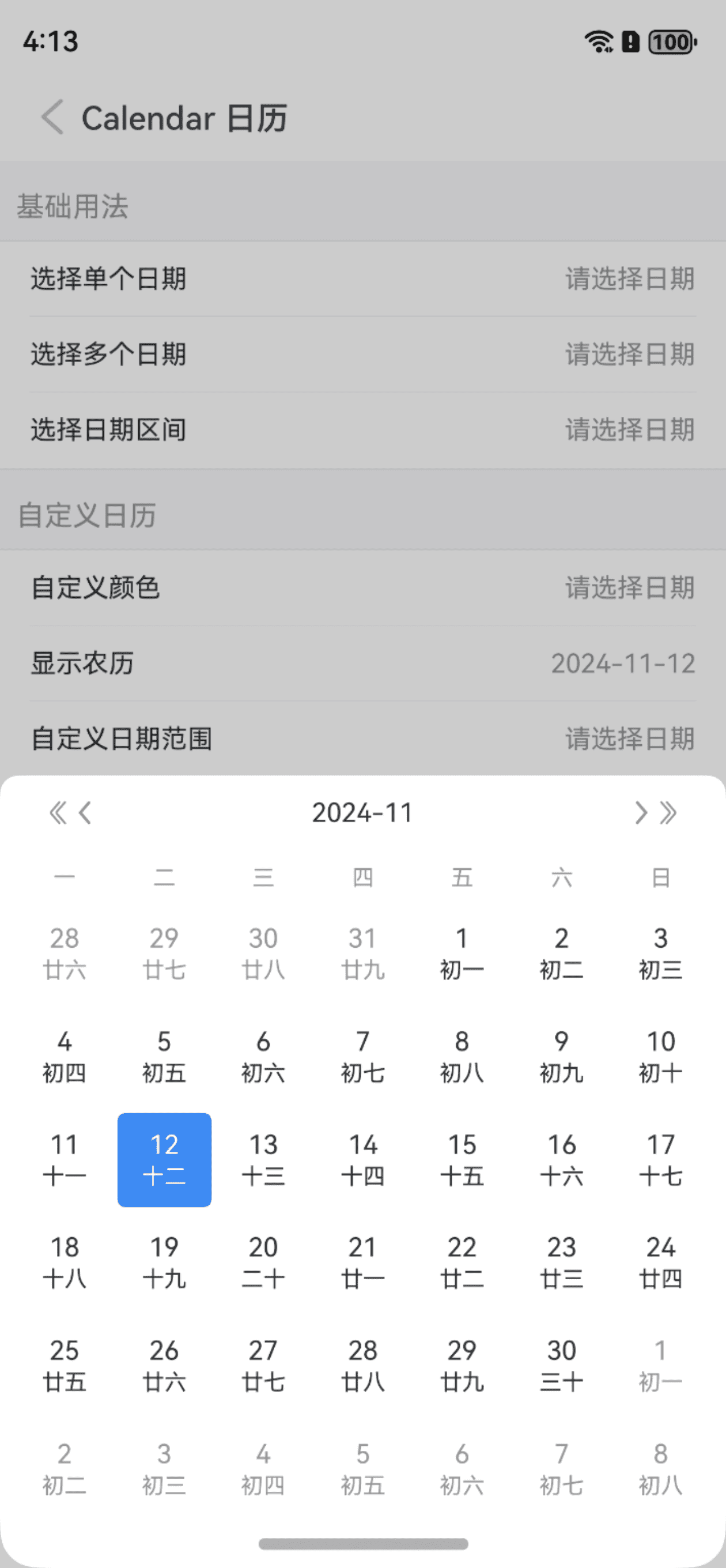
TIP
通过 isShowLunar 属性可设置显示农历,通过 cornerRadius 属性可设置弹框圆角。
点我查看代码
ts
@Entry
@Component
struct DemoPage {
  @State visible: boolean = false
  @State selectDate: string = ""
  build() {
    Column(){
      IBestCell({
        title: '选择日期',
        value: this.selectDate,
        isLink: true,
        onCellClick: () => {
          this.visible = true
        }
      })
      IBestCalendarDialog({
        visible: $visible,
        value: $selectDate,
        isShowLunar: true,
        cornerRadius: 20
      })
    }
  }
}
自定义日期范围
TIP
通过 minDate 属性可设置最小日期,maxDate 属性可设置最大日期。
点我查看代码
ts
@Entry
@Component
struct DemoPage {
@State visible: boolean = false
@State selectDate: string[] = []
build() {
Column(){
IBestCell({
title: '选择日期',
value: this.selectDate.join(","),
isLink: true,
onCellClick: () => {
this.visible = true
}
})
IBestCalendarDialog({
visible: $visible,
value: $selectDate,
selectType: "multiple",
selectedStyleType: "circle",
minDate: new Date('1991-01-01'),
maxDate: new Date(),
confirmBtnColor: "#ed4040",
confirmBtnText: "完成"
})
}
}
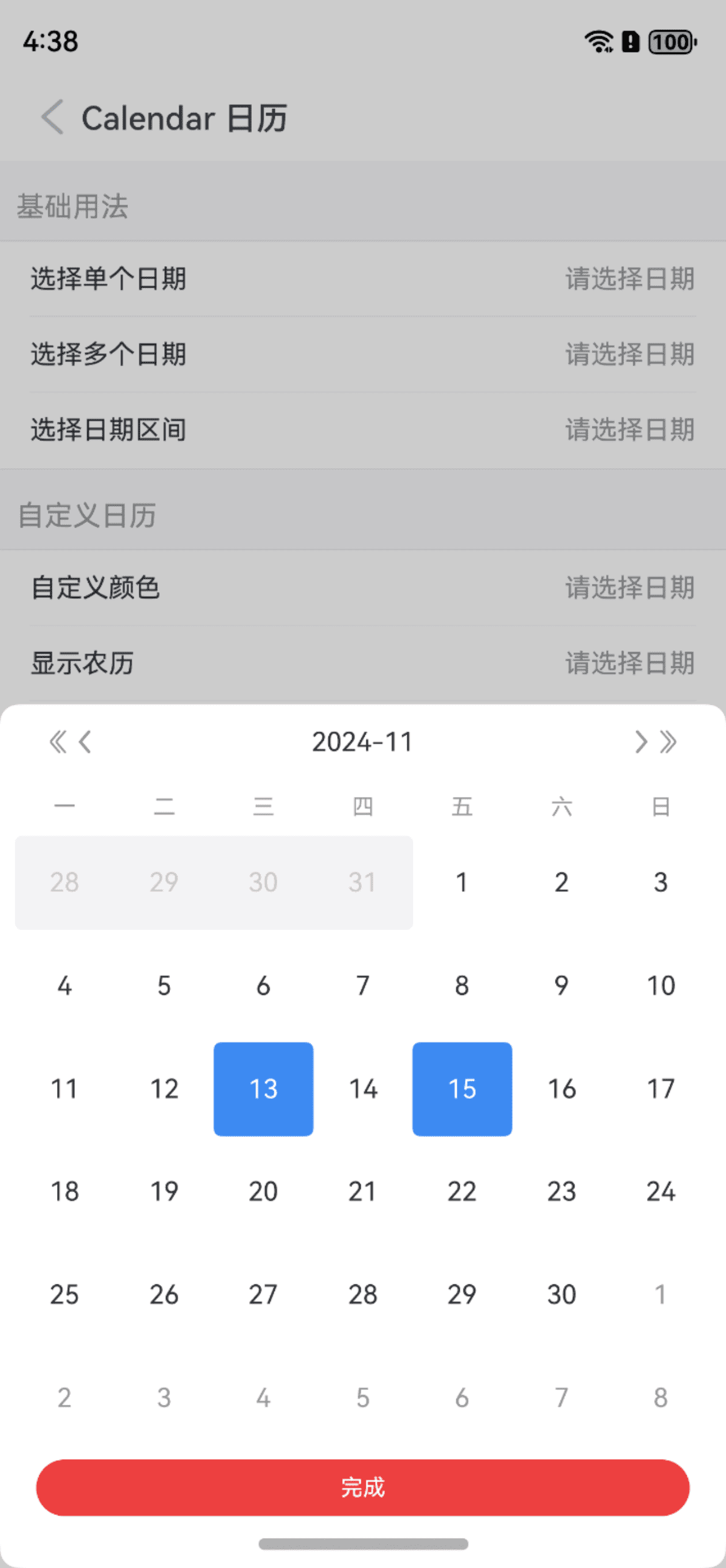
}区间最大范围
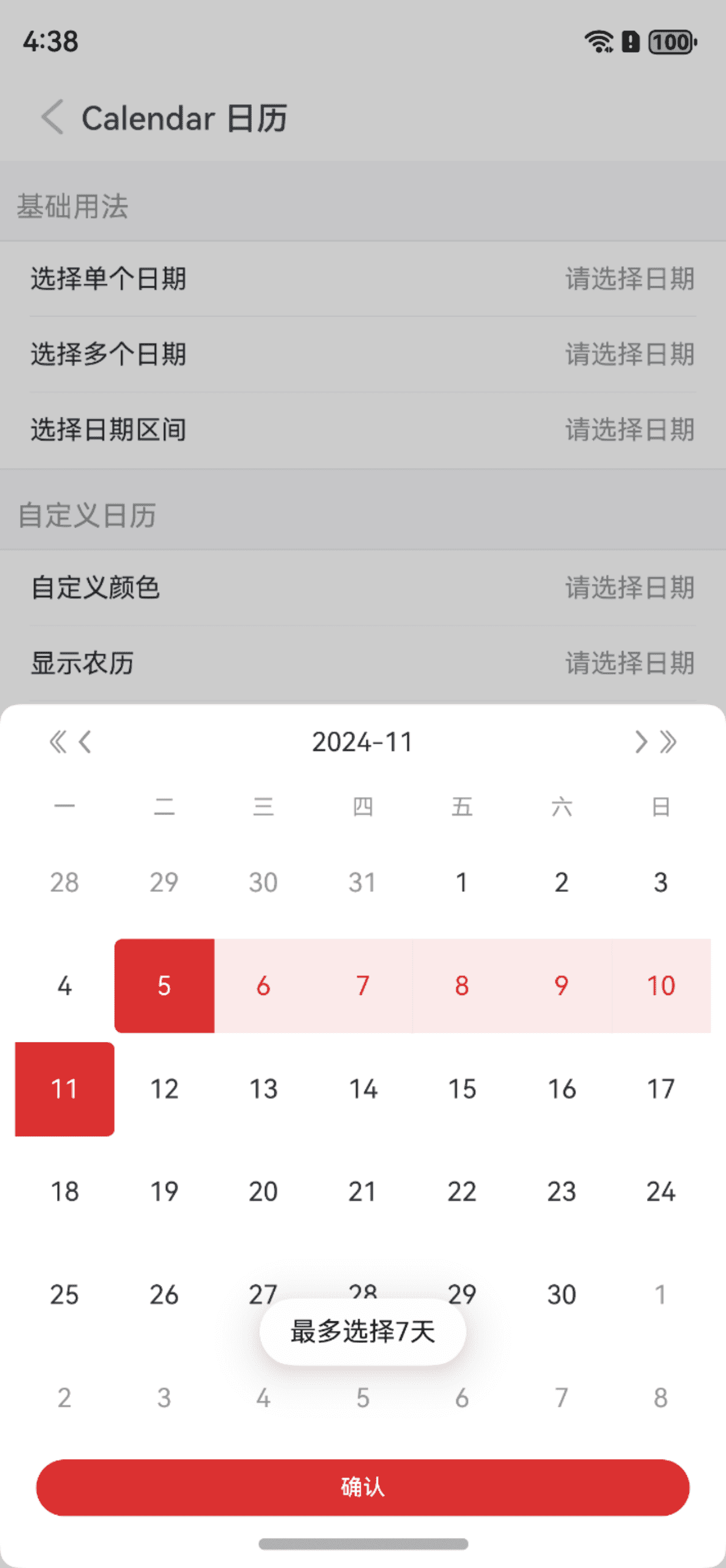
TIP
通过 maxRange 属性可设置区间最大范围。
点我查看代码
ts
@Entry
@Component
struct DemoPage {
  @State visible: boolean = false
  @State selectDate: string[] = []
  build() {
    Column(){
      IBestCell({
        title: '区间最大范围',
        value: this.selectDate.length ? this.selectDate[0] + " - " + this.selectDate[this.selectDate.length-1] : "",
        isLink: true,
        onCellClick: () => {
          this.visible = true
        }
      })
      IBestCalendarDialog({
        visible: $visible,
        value: $selectDate,
        type: "danger",
        selectType: "range",
        maxRange: 7
      })
    }
  }
}
自定义周起始日期
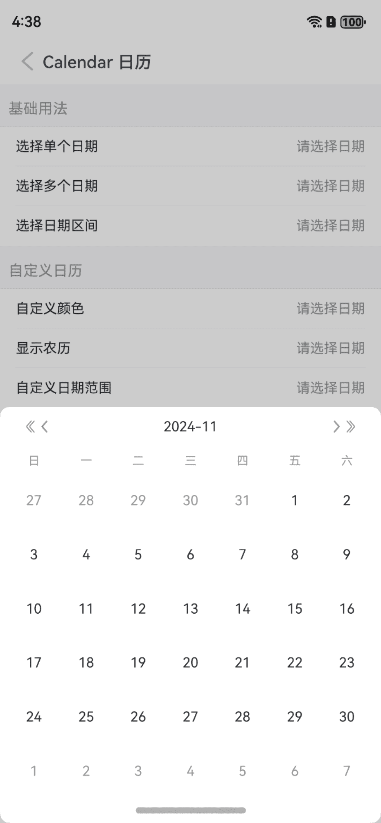
TIP
通过 weekFirstDay 属性可以自定义周起始日期。
点我查看代码
ts
@Entry
@Component
struct DemoPage {
  @State visible: boolean = false
  @State selectDate: string = ""
  build() {
    Column(){
      IBestCell({
        title: '选择日期',
        value: this.selectDate,
        isLink: true,
        onCellClick: () => {
          this.visible = true
        }
      })
      IBestCalendarDialog({
        visible: $visible,
        value: $selectDate,
        weekFirstDay: 0
      })
    }
  }
}
显示月份背景水印
TIP
通过 isShowMark 属性可以显示月份背景水印。
点我查看代码
ts
@Entry
@Component
struct DemoPage {
  @State visible: boolean = false
  @State selectDate: string = ""
  build() {
    Column(){
      IBestCell({
        title: '选择日期',
        value: this.selectDate,
        isLink: true,
        onCellClick: () => {
          this.visible = true
        }
      })
      IBestCalendarDialog({
        visible: $visible,
        value: $selectDate,
        weekFirstDay: 0
      })
    }
  }
}
平铺展示
点我查看代码
ts
@Entry
@Component
struct DemoPage {
  @State selectDate: string[] = []
  build() {
    Column(){
      IBestCalendar({
        value: $selectDate,
        isShowLunar: true,
        selectType: "multiple",
        isShowMark: true
      })
    }
  }
}
自定义单个日期样式
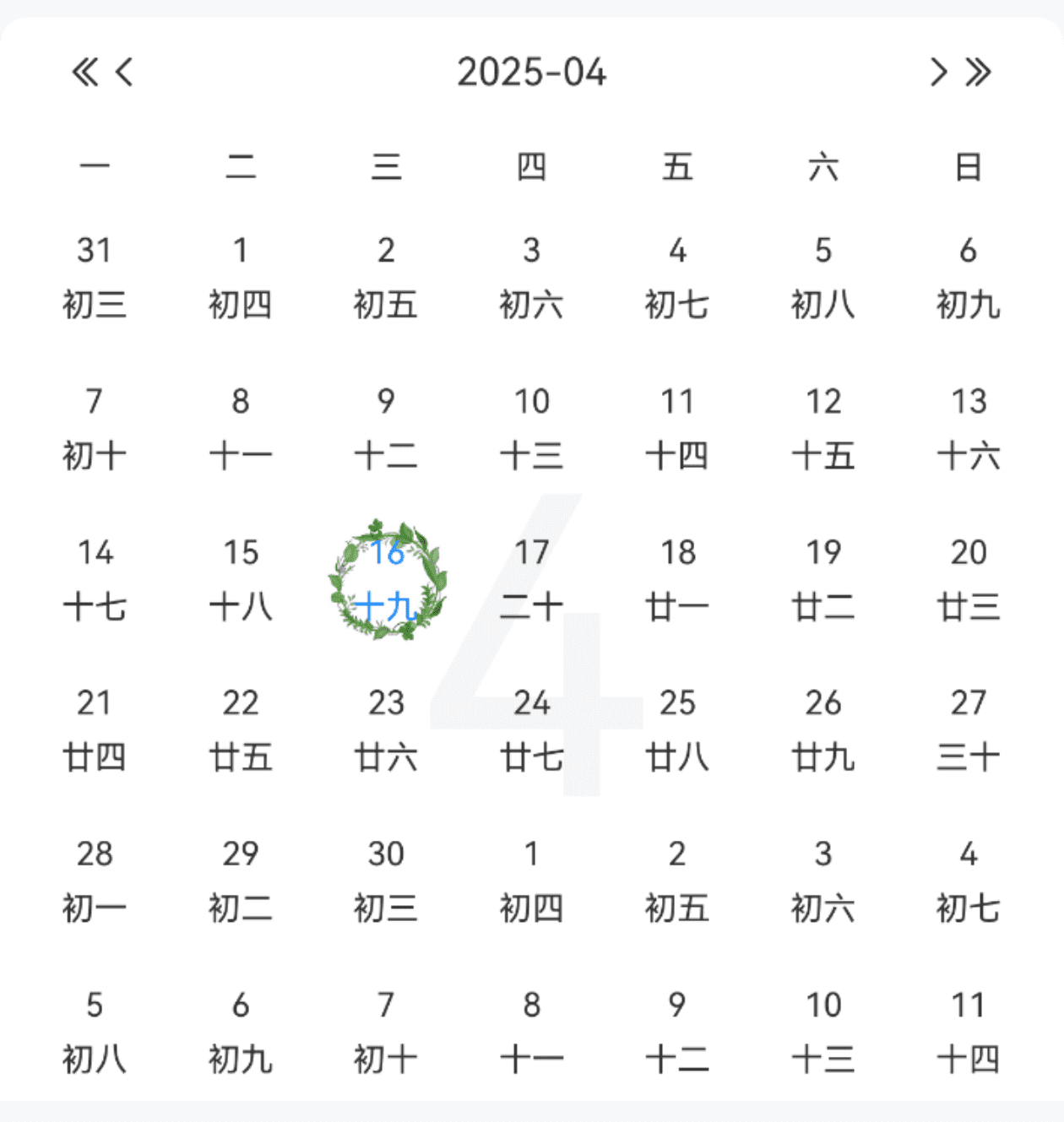
点我查看代码
ts
import { IBestCalendarDayItem } from "@ibestservices/ibest-ui";
@Entry
@Component
struct DemoPage {
  @State selectDate: string[] = []
  @Builder itemBuilder($$: IBestCalendarDayItem){
    Column({space: 6}){
      Text($$.day)
        .fontSize(12)
        .fontColor($$.isSelected ? "#1989fa" : "#333")
      Text($$.lunarDay)
        .fontSize(12)
        .fontColor($$.isSelected ? "#1989fa" : "#333")
    }
    .width(50)
    .aspectRatio(1)
    .justifyContent(FlexAlign.Center)
    .backgroundImage($$.isSelected ? "https://img95.699pic.com/xsj/0w/ev/jl.jpg%21/fh/300" : "")
    .backgroundImageSize(ImageSize.FILL)
    .backgroundImagePosition(Alignment.Center)
  }
  build() {
    Column(){
      IBestCalendar({
        value: $selectDate,
        selectType: "multiple",
        dayItemBuilder: this.itemBuilder   // 此处较为特殊, 只能这样传递, 否则UI不刷新
      })
    }
  }
}
打卡模式
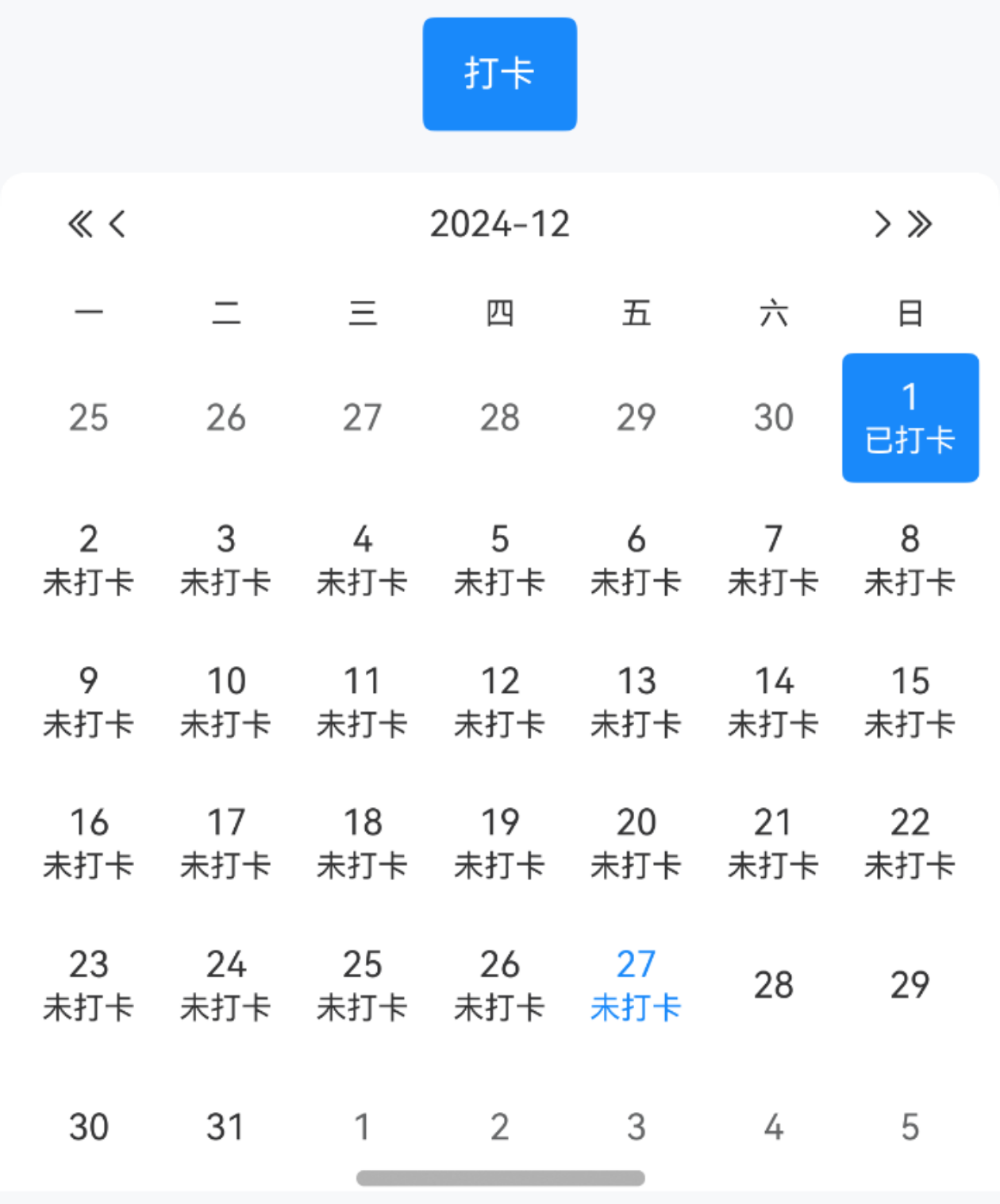
TIP
设置 clock 为 true, 可开启打卡模式, 打卡模式下只能切换年月, 不能选择日期.
点我查看代码
ts
import dayjs from "@hview/dayjs"
@Entry
@Component
struct DemoPage {
  @State clockDate: string[] = [dayjs().startOf("month").format('YYYY-MM-DD')]
  build() {
    Column({space: 14}){
      IBestButton({
        type: "primary",
        text: "打卡",
        onBtnClick: () => {
          this.clockDate.push(dayjs(this.clockDate[this.clockDate.length-1]).add(1, 'day').format("YYYY-MM-DD"))
        }
      })
      IBestCalendar({
        clock: true,
        value: $clockDate
      })
    }
  }
}
API
Calendar @Props
| 参数 | 说明 | 类型 | 默认值 |
|---|---|---|---|
| type | 主题类型,可选值为 primary success warning danger | string | primary |
| value | 已选日期,支持双向绑定 | string | string[] | [] |
| itemWidth | 每一项宽度 | string | number | 50 |
| weekFirstDay | 周起始日期, 周一到周六分别对应123456, 周日为 0 | number | 1 |
| isShowLunar | 是否显示农历 | boolean | false |
| selectType | 选择类型,可选值为 single multiple range | string | single |
| selectedStyleType | 选中样式,可选值为 normal circle | string | normal |
| selectedColor | 自定义选中颜色 | ResourceColor | |
| maxRange | selectType 为 range 时,最多可选天数,-1为无限制 | number | -1 |
| minDate | 最小可选日期 | Date | `` |
| maxDate | 最大可选日期 | Date | `` |
| isShowMark | 是否显示月份背景水印 | boolean | false |
| isShowHeader | 是否显示头部 | boolean | true |
| isShowConfirmBtn | 是否显示底部确定按钮 | boolean | false |
| confirmBtnColor | 确认按钮颜色 | ResourceColor | #3D8AF2 |
| confirmBtnText | 确认按钮文案 | ResourceStr | 确认 |
| cornerRadius | 弹框圆角 | Length | BorderRadiuses | LocalizedBorderRadiuses | 10 |
| clock | 开启打卡模式 | boolean | false |
| clockSuccessText | 打卡成功文案 | ResourceStr | 已成功 |
| isShowUnClock | 是否显示未打卡 | boolean | true |
| unClockText | 未打卡文案 | ResourceStr | 未打卡 |
| showOtherMonthDate | 是否显示其他月份的日期 | boolean | true |
CalendarDialog @Props
TIP
CalendarDialog包含Calendar除 isShowConfirmBtn 以外所有属性,CalendarDialog的 isShowConfirmBtn 属性默认为selectType不为single时显示,以下仅列Calendar不包含的属性
| 参数 | 说明 | 类型 | 默认值 |
|---|---|---|---|
| visible | 弹框展示状态 | boolean | false |
| isModal | 是否为模态窗口 | boolean | true |
| offsetY | 弹框底部偏移量 | number | 0 |
| cornerRadius | 弹框圆角 | string | number | 10 |
插槽
| 插槽名 | 说明 | 类型 |
|---|---|---|
| dayItemBuilder | 单个日期的插槽 | ($$: IBestCalendarDayItem) => void |
Events
| 事件名 | 说明 | 事件类型 |
|---|---|---|
| onConfirm | 选择日期后的回调,selectType 为 multiple 时需点击按钮触发 | (value: IBestCalendarConfirmResult[]) => void |
IBestCalendarDayItem 数据类型
| 参数 | 说明 | 类型 |
|---|---|---|
| date | 日期 | Date |
| dateStr | 日期字符串 | string |
| year | 年份 | string |
| month | 月份 | string |
| day | 天 | string |
| weekNum | 星期 | number |
| lunarMonth | 农历月份 | string |
| lunarDay | 农历天 | string |
| isCurMonthDay | 是否为当前月份的日期 | boolean |
| isSelected | 是否选中 | boolean |
| isDisabled | 是否禁用 | boolean |
| isClock | 是否打卡 | boolean |
IBestCalendarConfirmResult 数据类型
| 参数 | 说明 | 类型 |
|---|---|---|
| date | 选中日期 | Date |
| dateStr | 选中日期字符串 | string |
| lunarMonth | 农历月份 | string |
| lunarDay | 农历天 | string |
主题定制
组件提供了下列颜色变量,可用于自定义深色/浅色模式样式,使用方法请参考 颜色模式 章节,如需要其它颜色变量可提 issue。
| 名称 | 描述 | 默认值 |
|---|---|---|
| ibest_calendar_background | 日历背景色 | #fff |
| ibest_calendar_disabled_background | 日历禁用日期背景色 | #f7f8fa |
| ibest_calendar_month_mark_color | 月份水印颜色 | #f5f5f7 |