CarKeyboard 车牌键盘
介绍
通常与车牌输入框组件或其它自定义输入框配合使用。
TIP
阅读该组件文档前请确保已认真阅读快速上手章节的每一个字。
引入
ts
import { IBestCarKeyboard } from "@ibestservices/ibest-ui";代码演示
基础用法
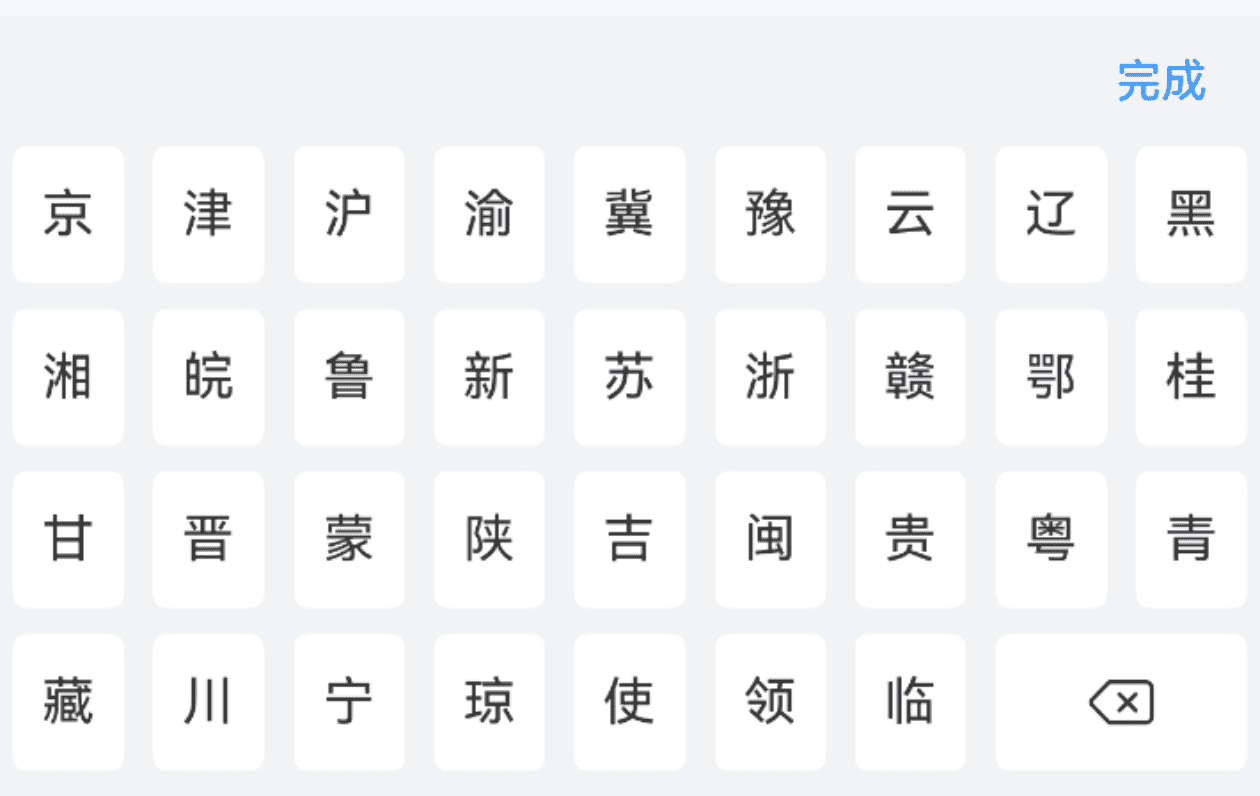
点我查看代码
ts
import { IBestCell } from "@ibestservices/ibest-ui"
@Entry
@Component
struct DemoPage {
@State visible: boolean = false
@State value: string = ''
build() {
Column(){
IBestCell({
title: '默认键盘',
value: this.value,
clickable: true,
onCellClick: () => {
this.visible = true
}
})
IBestCarKeyboard({
visible: $visible,
value: $value
})
}
}
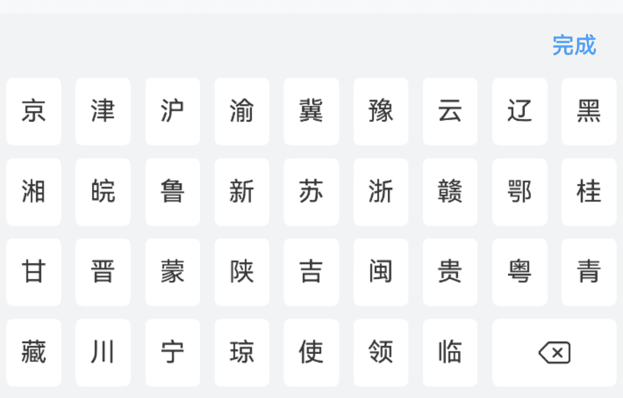
}最大长度
点我查看代码
ts
import { IBestCell } from "@ibestservices/ibest-ui"
@Entry
@Component
struct DemoPage {
@State visible: boolean = false
@State value: string = ''
build() {
Column(){
IBestCell({
title: '最大长度',
value: this.value,
clickable: true,
onCellClick: () => {
this.visible = true
}
})
IBestCarKeyboard({
visible: $visible,
value: $value,
maxLength: 7
})
}
}
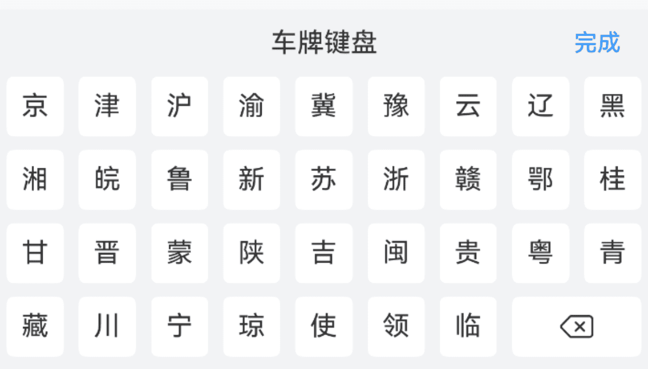
}自定义样式
点我查看代码
ts
import { IBestCell } from "@ibestservices/ibest-ui"
@Entry
@Component
struct DemoPage {
  @State visible: boolean = false
  @State value: string = ''
  build() {
    Column(){
      IBestCell({
        title: '自定义样式',
        value: this.value,
        clickable: true,
        onCellClick: () => {
          this.visible = true
        }
      })
      IBestCarKeyboard({
        visible: $visible,
        value: $value,
        title: "车牌键盘",
        keyHeight: 36
      })
    }
  }
}
API
@Props
| 参数 | 说明 | 类型 | 默认值 |
|---|---|---|---|
| visible | 控制键盘显隐, 支持双向绑定 | boolean | false |
| value | 当前输入的值, 支持双向绑定 | string | '' |
| maxLength | 最大长度 | number | 8 |
| title | 顶部标题文字 | ResourceStr | '' |
| confirmBtnText | 确认按钮文字 | ResourceStr | 完成 |
| keyHeight | 按键高度 | string | number | 42 |
Events
| 事件名 | 说明 | 事件类型 |
|---|---|---|
| onInput | 按下按键后触发 | (value: string) => void |
| onDelete | 点击删除键时触发 | () => void |
| onClose | 点击关闭键时触发 | () => void |
| onConfirm | 点击完成键时触发 | (value: string) => void |
主题定制
组件提供了下列颜色变量,可用于自定义深色/浅色模式样式,使用方法请参考 颜色模式 章节,如需要其它颜色变量可提 issue。
| 名称 | 描述 | 默认值 |
|---|---|---|
| ibest_car_keyboard_background | 键盘背景色 | #f2f3f5 |
| ibest_car_keyboard_key_background | 键盘按键背景色 | #fff |
| ibest_car_keyboard_key_active_color | 键盘按键激活态背景色 | #ebedf0 |