ColorPicker 颜色选择器
介绍
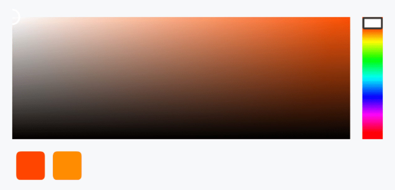
用于选择颜色。
TIP
阅读该组件文档前请确保已认真阅读快速上手章节的每一个字。
引入
ts
import { IBestColorPicker } from "@ibestservices/ibest-ui";代码演示
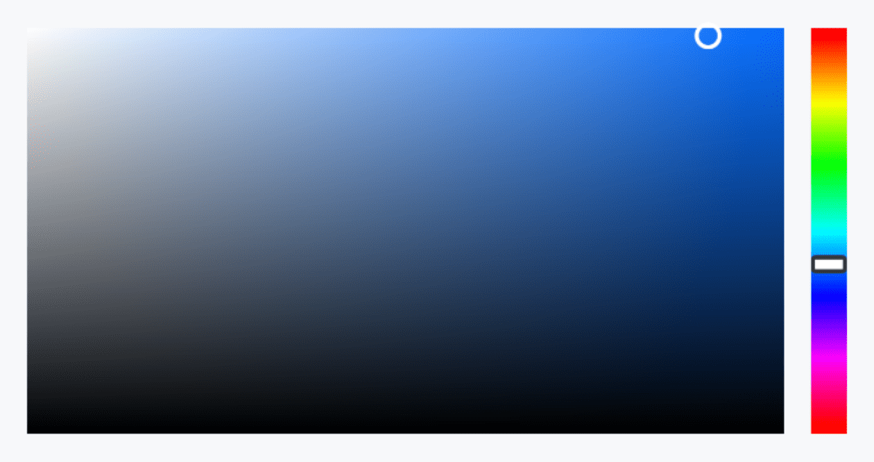
基础用法
点我查看代码
ts
@Entry
@Component
struct DemoPage {
@State color: string = "#1989fa"
build() {
Column(){
IBestColorPicker({
value: $color
})
}
}
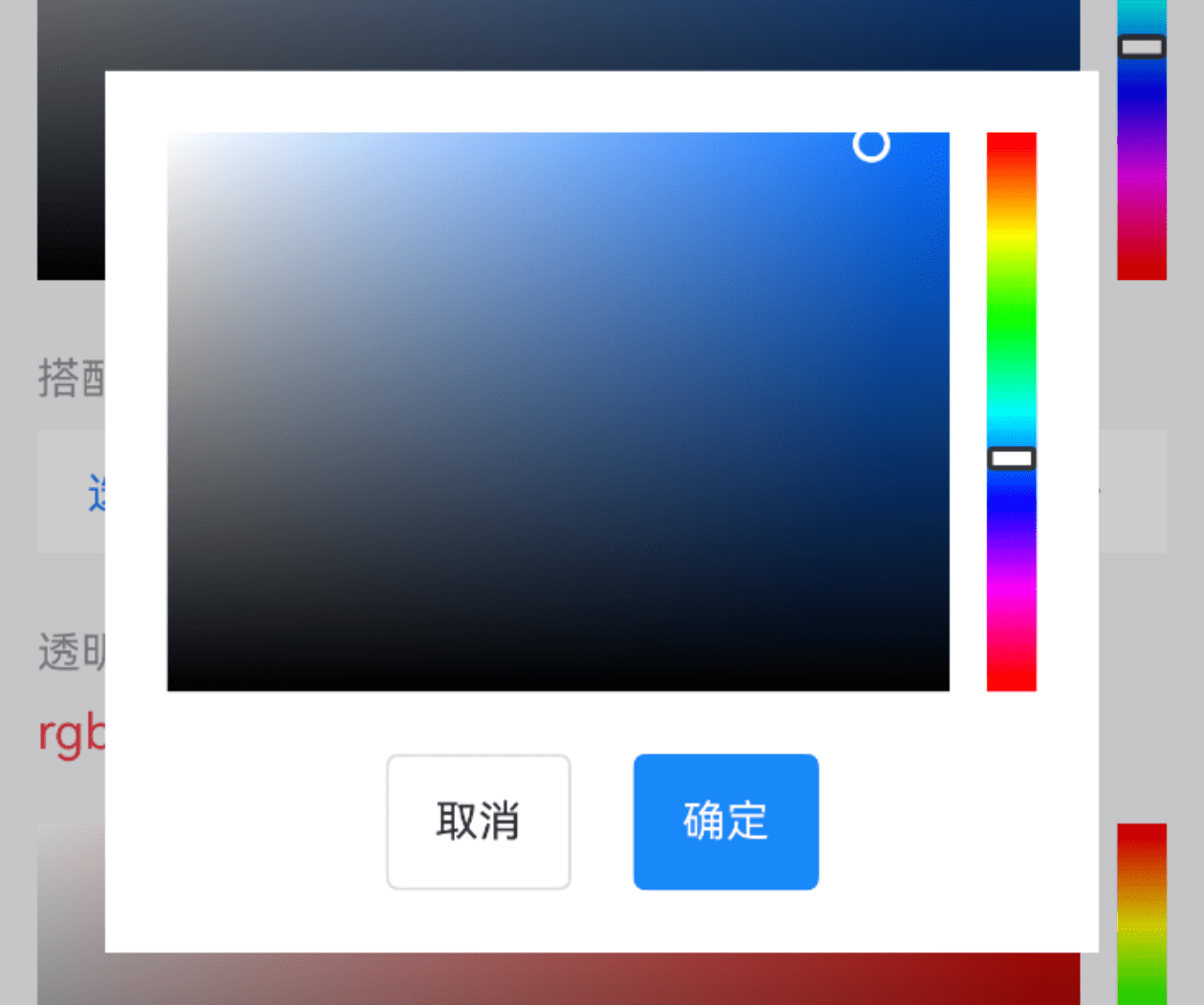
}搭配弹出层使用
点我查看代码
ts
import { IBestField, IBestPopup } from '@ibestservices/ibest-ui'
@Entry
@Component
struct DemoPage {
  @State color: string = "#1989fa"
  @State visible: boolean = false
  @Builder pickerBuilder(){
    Column({space: 20}){
      IBestColorPicker({
        value: $color
      })
      Row({space: 20}){
        IBestButton({
          text: "取消",
          onBtnClick: () => {
            this.visible = false
          }
        })
        IBestButton({
          type: "primary",
          text: "确定",
          onBtnClick: () => {
            this.visible = false
          }
        })
      }
    }.padding(20)
  }
  build() {
    Column(){
      IBestField({
        label: '选择颜色',
        value: this.color,
        placeholder: "请选择颜色",
        labelColor: this.color,
        isLink: true,
        hasBorder: false,
        onFieldClick: () => {
          this.visible = true
        }
      })
      // 弹出层
      IBestPopup({
        visible: $visible,
        popupWidth: 320,
        contentBuilder: (): void => this.pickerBuilder()
      })
    }
  }
}
透明度
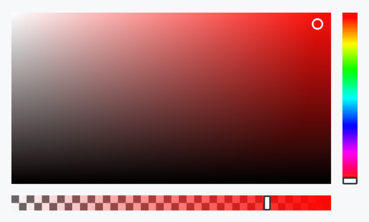
点我查看代码
ts
@Entry
@Component
struct DemoPage {
  @State color: string = "rgba(238,10,36,0.8)"
  build() {
    Column(){
      IBestColorPicker({
        value: $color,
        enableAlpha: true
      })
    }
  }
}
预定颜色
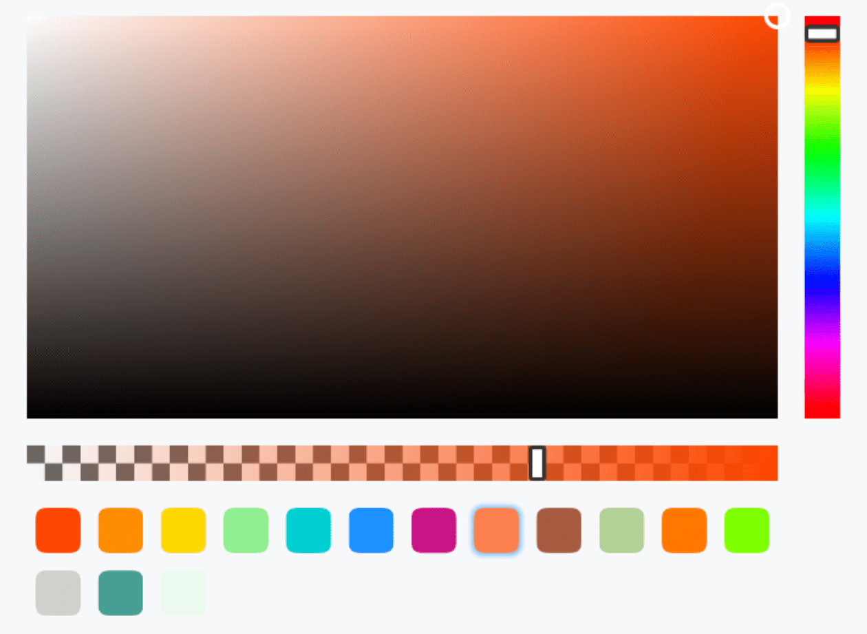
点我查看代码
ts
@Entry
@Component
struct DemoPage {
  @State color: string = "rgba(255, 69, 0, 0.68)"
  build() {
    Column(){
      IBestColorPicker({
        value: $color,
        enableAlpha: true,
        predefineColors: [
          '#ff4500',
          '#ff8c00',
          '#ffd700',
          '#90ee90',
          '#00ced1',
          '#1e90ff',
          '#c71585',
          'rgba(255, 69, 0, 0.68)',
          'rgba(146, 50, 20, 0.8)',
          'rgba(107, 167, 50, 0.5)',
          'rgb(255, 120, 0)',
          'rgb(125, 255, 0)',
          '#ffced1cc',
          '#c7158577',
          '#1e90ff99'
        ]
      })
    }
  }
}
自定义尺寸
点我查看代码
ts
@Entry
@Component
struct DemoPage {
  @State color: string = ""
  build() {
    Column(){
      IBestColorPicker({
        value: $color,
        panelHeight: 120,
        cursorWidth: 16,
        hueSliderWidth: 20,
        hueSliderHeight: 12,
        predefineBlockWidth: 28,
        predefineColors: [
          '#ff4500',
          '#ff8c00'
        ]
      })
    }
  }
}
API
@Props
| 参数 | 说明 | 类型 | 默认值 |
|---|---|---|---|
| value | 当前选中的颜色值, 支持双向绑定, 仅支持 hex 或 rgb 格式 | string | '' |
| colorFormat | 指定传入的颜色格式, 可选值 rgb 、hex | string | hex |
| enableAlpha | 是否支持透明度选择 | boolean | false |
| bgColor | 整体背景色 | ResourceColor | '' |
| panelHeight | 面板高度 | string | number | 180 |
| cursorWidth | 颜色选取块宽度(宽高一致) | string | number | 12 |
| hueSliderWidth | 色彩滑块宽度 | string | number | 16 |
| hueSliderHeight | 色彩滑块高度 | string | number | 8 |
| alphaSliderWidth | 透明度滑块宽度 | string | number | 8 |
| alphaSliderHeight | 透明度滑块高度 | string | number | 16 |
| panelHueSpace | 颜色面板与色彩滑块之间的距离 | string | number | 12 |
| panelAlphaSpace | 颜色面板与透明度滑块之间的距离 | string | number | 12 |
| predefineColors | 预设颜色 | string[] | [] |
| predefineBlockWidth | 预设颜色块宽度(宽高一致) | string | number | 20 |
Events
| 事件名 | 说明 | 事件类型 |
|---|---|---|
| onChange | 颜色变化时触发 | (value: string) => void |