DatePicker 日期选择
介绍
日期选择器,用于选择年、月、日,通常与弹出层组件配合使用。
TIP
阅读该组件文档前请确保已认真阅读快速上手章节的每一个字。
引入
ts
import { IBestDatePicker, IBestDatePickerResult, IBestPickerOption } from "@ibestservices/ibest-ui";代码演示
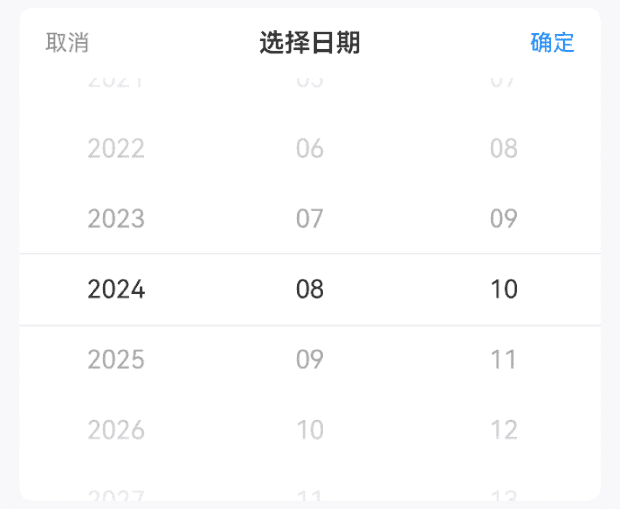
基础用法
TIP
通过 minDate maxDate 属性可控制日期范围。
• 默认最小日期为十年前;
• 默认最大日期为十年后。
点我查看代码
ts
@Entry
@Component
struct DemoPage {
@State selectValue: string[] = ["2024", "08", "10"]
build() {
Column(){
IBestDatePicker({
title: "选择日期",
minDate: new Date("2020-05-01"),
maxDate: new Date("2028-05-01"),
value: $selectValue,
onConfirm: (value: IBestDatePickerResult) => {
IBestToast.show(this.selectValue.join("-") , value.dateStr)
},
onChange: (value: IBestDatePickerResult) => {
IBestToast.show(this.selectValue.join("-") , value.dateStr)
}
})
}
}
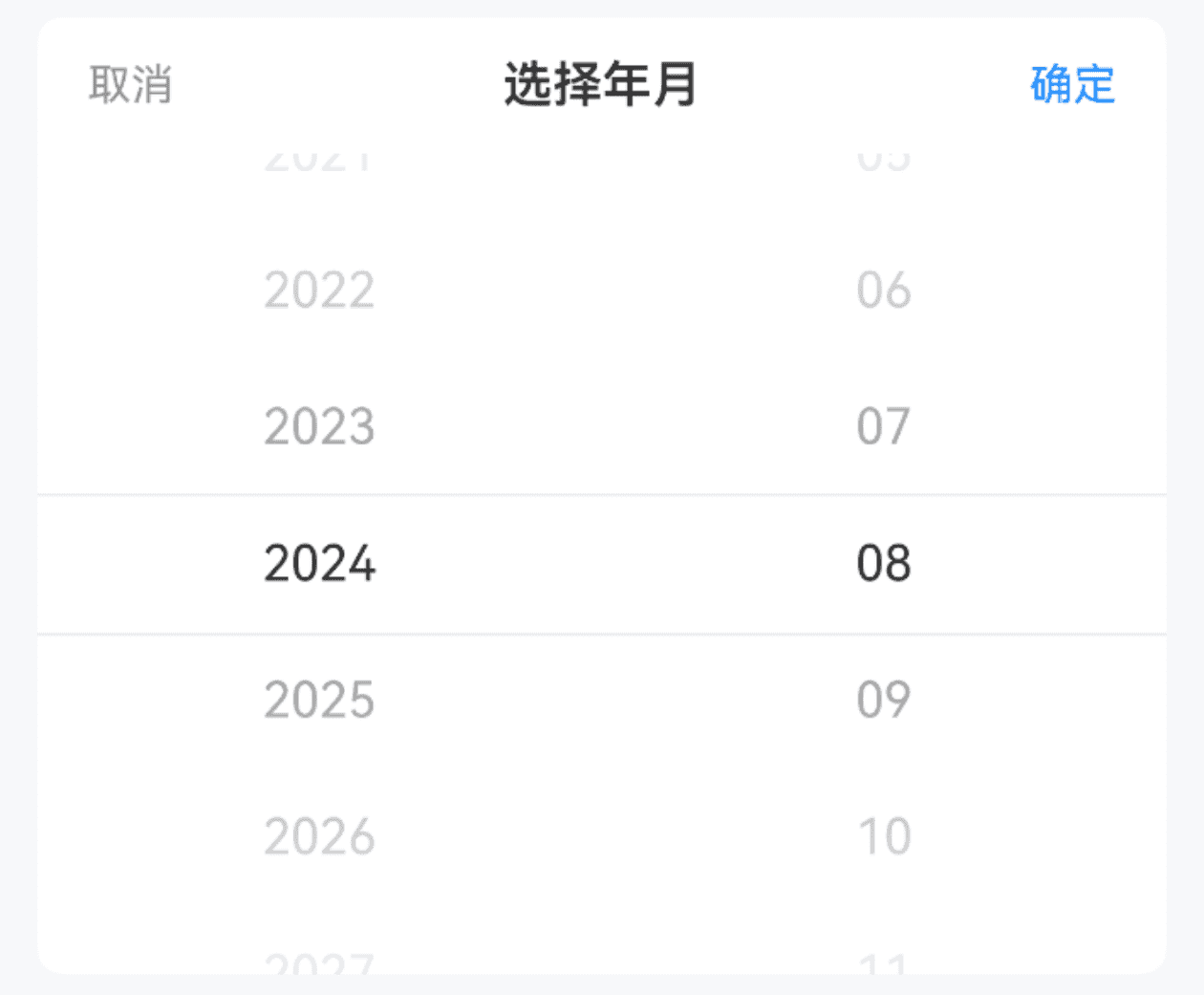
}选项类型
点我查看代码
ts
@Entry
@Component
struct DemoPage {
@State selectValue: string[] = ["2024", "08"]
build() {
Column(){
IBestDatePicker({
title: "选择日期",
minDate: new Date("2020-05"),
maxDate: new Date("2028-05"),
isShowDay: false,
value: $selectValue,
onConfirm: (value: IBestDatePickerResult) => {
IBestToast.show(this.selectValue.join("-") , value.dateStr)
},
onChange: (value: IBestDatePickerResult) => {
IBestToast.show(this.selectValue.join("-") , value.dateStr)
}
})
}
}
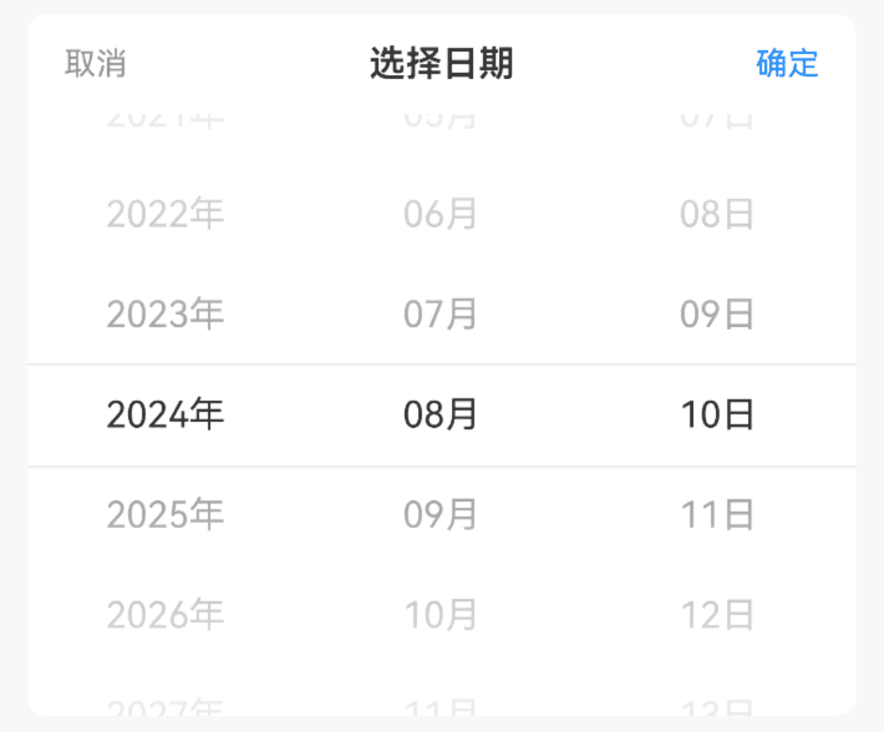
}显示单位
点我查看代码
ts
@Entry
@Component
struct DemoPage {
@State selectValue: string[] = ["2024", "08", "18"]
build() {
Column(){
IBestDatePicker({
title: "选择日期",
minDate: new Date("2020-05-01"),
maxDate: new Date("2028-05-01"),
showUnit: true,
value: $selectValue,
onConfirm: (value: IBestDatePickerResult) => {
IBestToast.show(this.selectValue.join("-") , value.dateStr)
},
onChange: (value: IBestDatePickerResult) => {
IBestToast.show(this.selectValue.join("-") , value.dateStr)
}
})
}
}
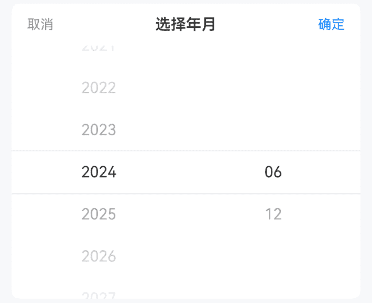
}过滤选项
点我查看代码
ts
@Entry
@Component
struct DemoPage {
  @State selectValue: string[] = ["2024", "08"]
  filter(type: string, options: IBestPickerOption[]): IBestPickerOption[]{
    if (type === 'month') {
      return options.filter((option) => Number(option.value) % 6 === 0)
    }
    return options
  }
  build() {
    Column(){
      IBestDatePicker({
        title: "选择日期",
        minDate: new Date("2020-05"),
        maxDate: new Date("2028-05"),
        isShowDay: false,
        filter: this.filter,
        value: $selectValue,
        onConfirm: (value: IBestDatePickerResult) => {
          IBestToast.show(this.selectValue.join("-") , value.dateStr)
        },
        onChange: (value: IBestDatePickerResult) => {
          IBestToast.show(this.selectValue.join("-") , value.dateStr)
        }
      })
    }
  }
}
API
@Props
| 参数 | 说明 | 类型 | 默认值 |
|---|---|---|---|
| groupId | 分组id, 通常在配合PickerGroup组件使用时传入, 可实现多个DatePicker联动 | string | number | '' |
| value | 当前选中的日期, 支持双向绑定 | string[] | [] |
| minDate | 最小可选日期 | Date | 十年前 |
| maxDate | 最大可选日期 | Date | 十年后 |
| isShowDay | 是否显示日列 | boolean | true |
| showUnit | 是否显示单位 | boolean | false |
| title | 标题 | ResourceStr | '' |
| itemHeight | 单项高度 | string | number | 44 |
| visibleItemCount | 可见选项数量 | number | 6 |
| showToolBar | 是否显示顶部栏 | boolean | true |
| confirmText | 确认按钮文字 | ResourceStr | 确定 |
| cancelText | 取消按钮文字 | ResourceStr | 取消 |
| filter | 过滤器 | (type: string, options: IBestPickerOption[]) => IBestPickerOption[] | null |
| horizontal | 是否横向 | boolean | false |
| itemWidth | 单项宽度 | string | number | 44 |
| contentHeight | 整体高度, 仅横向时生效 | string | number | 44 |
| optionFontSize | 选项字体大小 | string | number | 16 |
| lunar | 是否显示农历 | boolean | false |
| radius | 外部圆角 | string | number | 0 |
| fontColor 2.2.5 | 未选中字体颜色 | ResourceColor | #323233 |
| fontWeight 2.2.5 | 未选中字体字重 | FontWeight | Normal |
| selectedFontSize 2.2.5 | 选中字体大小 | string | number | 16 |
| selectedFontColor 2.2.5 | 选中字体颜色 | ResourceColor | #323233 |
| selectedFontWeight 2.2.5 | 选中字体字重 | FontWeight | Normal |
Events
| 事件名 | 说明 | 事件类型 |
|---|---|---|
| onChange | 某一列选项变更后触发 | (value: IBestDatePickerResult) => void |
| onConfirm | 点击确定按钮时触发 | (value: IBestDatePickerResult) => void |
| onCancel | 点击取消按钮时触发 | () => void |
IBestDatePickerResult 数据结构
| 参数 | 说明 | 类型 |
|---|---|---|
| dateStr | 选中的日期字符串 | string |
| date | 选中的日期 | Date |
| year | 选中的年份 | string |
| month | 选中的月份 | string |
| day | 选中的日期 | string |