Divider 分割线
介绍
用于将内容分隔为多个区域。
TIP
阅读该组件文档前请确保已认真阅读快速上手章节的每一个字。
引入
ts
import { IBestDivider } from "@ibestservices/ibest-ui";代码演示
基础用法
点我查看代码
ts
@Entry
@Component
struct DemoPage {
  build() {
    Column(){
      IBestDivider()
    }
  }
}
展示文本
点我查看代码
ts
@Entry
@Component
struct DemoPage {
@Builder textBuilder(){
Row({space: 10}){
Image($r("app.media.icon_star")).width(16)
Text("自定义内容")
}
}
build() {
Column({space: 16}){
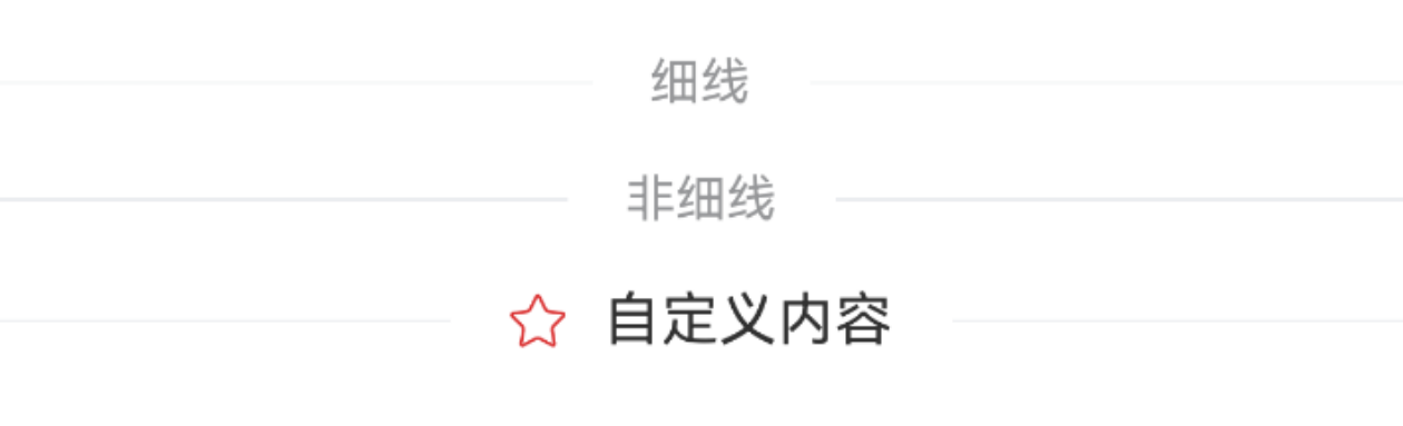
IBestDivider({ text: '细线' })
IBestDivider({text: '非细线', hairline: false})
IBestDivider({
textBuilder: this.textBuilder
})
}.padding({top: 16, bottom: 16})
}
}内容位置

点我查看代码
ts
@Entry
@Component
struct DemoPage {
build() {
Column({space: 16}){
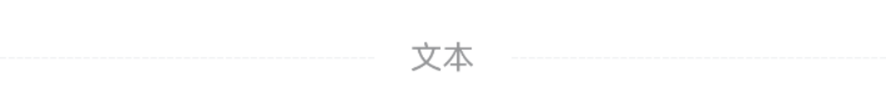
IBestDivider({
text: '文本',
leftLineWidth: "10%"
})
IBestDivider({
text: '文本',
rightLineWidth: 50
})
}.padding({top: 16, bottom: 16})
}
}虚线
点我查看代码
ts
@Entry
@Component
struct DemoPage {
  build() {
    Column(){
      IBestDivider({
        text: '文本',
        dashed: true
      })
    }
  }
}
自定义样式
点我查看代码
ts
@Entry
@Component
struct DemoPage {
build() {
Column(){
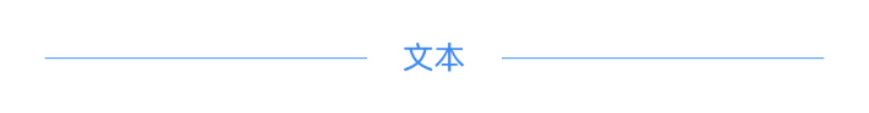
IBestDivider({
text: '文本',
color: "#3d8af2",
lineColor: "#3d8af2",
leftRightPadding: 20
})
}
}
}垂直

点我查看代码
ts
@Entry
@Component
struct DemoPage {
  build() {
    Row(){
      IBestDivider({ text: '文本', vertical: true })
      Text("文本")
      IBestDivider({ text: '文本', vertical: true, dashed: true })
      Text("文本")
      IBestDivider({ text: '文本', vertical: true, hairline: false })
      Text("文本")
      IBestDivider({ text: '文本', vertical: true, lineColor: "#3d8af2" })
    }.padding(16)
  }
}
API
@Props
| 参数 | 说明 | 类型 | 默认值 |
|---|---|---|---|
| lineWidth | 线宽, 仅hairline为false时生效 | string | number | 1 |
| dashed | 是否使用虚线 | boolean | false |
| hairline | 是否显示细线 | boolean | true |
| vertical | 是否为垂直方向 | boolean | false |
| lineHeight | 分割线高度, 仅垂直时有效 | string | number | 14 |
| lineColor | 分割线颜色 | ResourceColor | #ebedf0 |
| text | 文本内容, 仅水平时生效 | ResourceStr | '' |
| color | 文本内容颜色, 仅水平时生效 | ResourceColor | #969799 |
| textFontSize | 文本字体大小, 仅水平时生效 | string | number | 14 |
| textLineSpace | 文本与线段间距, 仅水平时生效 | string | number | 16 |
| leftLineWidth | 左侧线段宽度, 仅水平时生效 | string | number | '' |
| rightLineWidth | 右侧线段宽度, 仅水平时生效 | string | number | '' |
| leftRightPadding | 左右内边距, 仅水平时生效 | string | number | 0 |
| leftRightMargin | 左右外边距, 仅垂直时生效 | string | number | 8 |
| dashGap | 虚线间距, 仅在dashed为true时生效 | LengthMetrics | - |
| dashWidth | 虚线线段长度, 仅在dashed为true时生效 | LengthMetrics | - |
| rightLineColor | 右侧线颜色, 默认与lineColor一致 | ResourceColor | '' |
| rightDashed | 右侧线是否使用虚线, 默认与dashed一致 | boolean | false |
插槽
| 插槽名 | 说明 | 类型 |
|---|---|---|
| textBuilder | 自定义文本内容 | CustomBuilder |
主题定制
组件提供了下列颜色变量,可用于自定义深色/浅色模式样式,使用方法请参考 颜色模式 章节,如需要其它颜色变量可提 issue。
| 名称 | 描述 | 默认值 |
|---|---|---|
| ibest_divider_border_color | 分割线颜色 | #ebedf0 |