Field 输入框
介绍
用户可以在文本框内输入或编辑文字。
TIP
阅读该组件文档前请确保已认真阅读快速上手章节的每一个字。
引入
import { IBestField } from "@ibestservices/ibest-ui";代码演示
基础用法

TIP
通过 value 属性可绑定输入框的值, 使用 $ 可双向绑定。
点我查看代码
@Entry
@Component
struct DemoPage {
  @State value: string = ""
  build() {
    Column(){
      IBestField({
        value: $value,
        label: "文本",
        placeholder: "请输入文本",
        hasBorder: false
      })
    }
  }
}
自定义类型
TIP
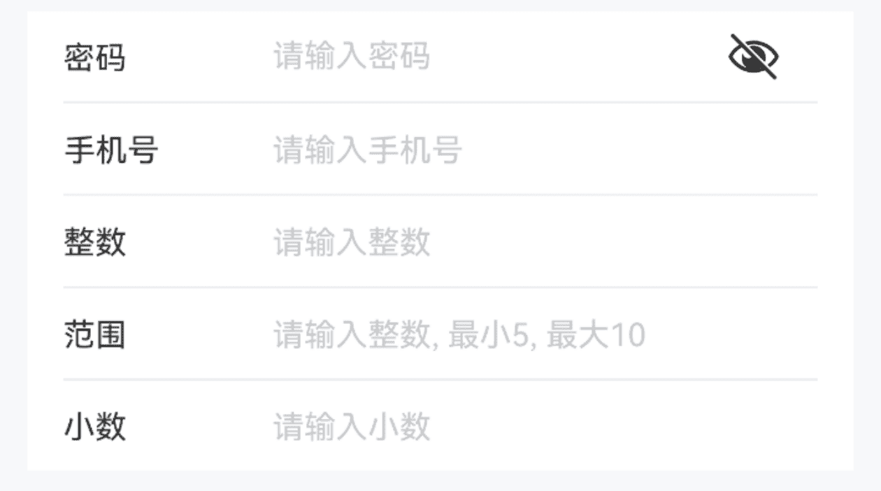
通过 type 属性可指定输入框的类型, 默认为 normal。
点我查看代码
@Entry
@Component
struct DemoPage {
  @State value1: string = ""
  @State value2: string = ""
  @State value3: string = ""
  @State value4: string = ""
  @State value5: string = ""
  build() {
    Column(){
      // 密码
      IBestField({
        value: $value1,
        label: "密码",
        placeholder: "请输入密码",
        type: "password"
      })
      // 手机号
      IBestField({
        value: $value2,
        label: "手机号",
        placeholder: "请输入手机号",
        type: "phone"
      })
      // 整数数字
      IBestField({
        value: $value3,
        label: "整数",
        placeholder: "请输入整数",
        type: "number"
      })
      // 范围
      IBestField({
        value: $value4,
        label: "范围",
        placeholder: "请输入整数, 最小5, 最大10",
        type: "number",
        min: 5,
        max: 10
      })
      // 小数
      IBestField({
        value: $value5,
        label: "小数",
        hasBorder: false,
        placeholder: "请输入小数",
        type: "decimal"
      })
    }
  }
}
禁用输入框
TIP
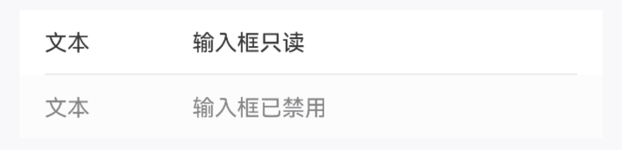
通过 disabled 属性可设置输入框是否禁用, 通过 readonly 属性可设置输入框是否只读。
点我查看代码
@Entry
@Component
struct DemoPage {
  @State value1: string = '输入框只读'
  @State value2: string = '输入框已禁用'
  build() {
    Column(){
      IBestField({
        value: $value1,
        label: "文本",
        readOnly: true
      })
      IBestField({
        value: $value2,
        label: "文本",
        hasBorder: false,
        disabled: true
      })
    }
  }
}
前后缀
点我查看代码
@Entry
@Component
struct DemoPage {
@State value: string = ''
build() {
Column(){
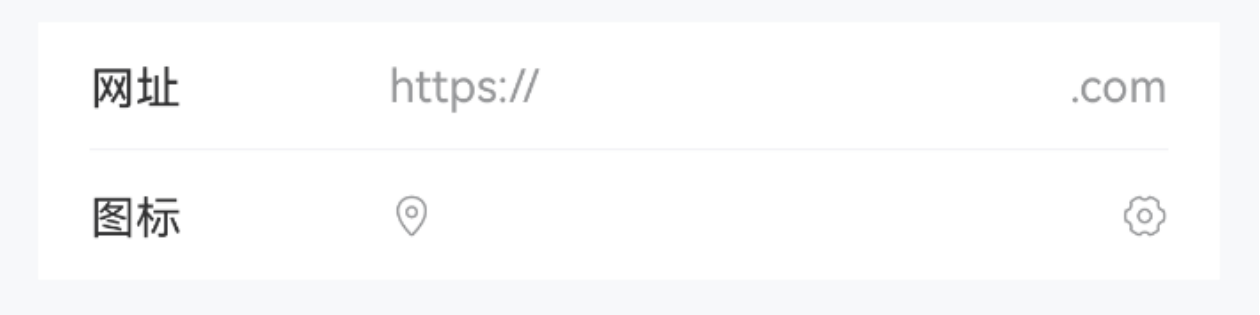
IBestField({
value: $value,
label: "网址",
prefix: "https://",
suffix: ".com"
})
IBestField({
value: $value,
label: "图标",
prefixIcon: "location-o",
suffixIcon: "setting-o",
hasBorder: false
})
}
}
}显示图标
TIP
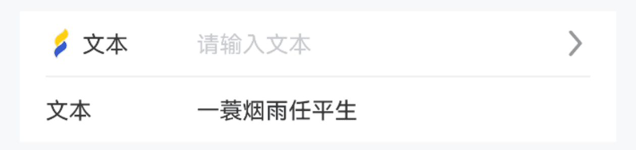
通过 leftIcon rightIcon 属性可设置输入框左、右侧的图标, clearable 可显示输入框清除图标。
点我查看代码
@Entry
@Component
struct DemoPage {
  @State value1: string = ''
  @State value2: string = '一蓑烟雨任平生'
  build() {
    Column(){
      IBestField({
        value: $value1,
        label: "文本",
        placeholder: "请输入文本",
        leftIcon: "https://ibestui.ibestservices.com/favicon.ico",
        rightIcon: $r("app.media.arrow_right")
      })
      IBestField({
        value: $value2,
        label: "文本",
        placeholder: "请输入文本",
        hasBorder: false,
        clearable: true
      })
    }
  }
}
必填星号
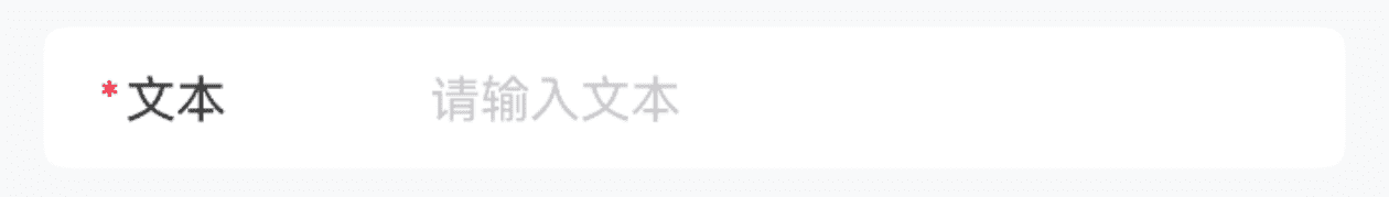
TIP
通过 required 属性来展示必填星号。
• 请注意 required 属性只用于控制星号展示,在进行表单校验时,需要使用 rule.required 选项来控制校验逻辑。
点我查看代码
@Entry
@Component
struct DemoPage {
  @State value: string = ''
  build() {
    Column(){
      IBestField({
        value: $value,
        label: "文本",
        placeholder: "请输入文本",
        hasBorder: false,
        radius: 6,
        required: true
      })
    }
  }
}
插入按钮

TIP
通过 buttonBuilder 插槽可以在输入框的尾部插入按钮。
点我查看代码
import { IBestButton } from "@ibestservices/ibest-ui";
@Entry
@Component
struct DemoPage {
  @State value: string = ''
  @State count: number = 60
  @State timer: number = 0
  @Builder sendCodeButton() {
    IBestButton({
      text: this.count == 60 ? '发送验证码' : `重新发送(${this.count})`,
      type: 'primary',
      buttonSize: 'mini',
      onBtnClick: () => {
          this.sendCode()
      }
    })
  }
  sendCode() {
    if (this.timer) {
      return
    }
    this.count = 60
    this.timer = setInterval(() => {
      if (this.count > 0) {
        this.count--
      } else {
        clearInterval(this.timer)
        this.timer = 0
        this.count = 60
      }
    }, 1000)
  }
  build() {
    Column(){
      IBestField({
        value: $value,
        label: "短信验证码",
        placeholder: "请输入验证码",
        hasBorder: false,
        buttonBuilder: (): void => this.sendCodeButton()
      })
    }
  }
}
格式化输入内容
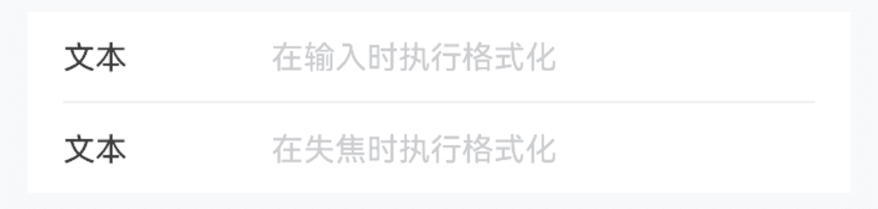
TIP
通过 formatter 属性可以对输入的内容进行格式化,通过 `formatTrigger 属性可以指定执行格式化的时机,默认在输入时进行格式化。
点我查看代码
@Entry
@Component
struct DemoPage {
  @State value1: string = ''
  @State value2: string = ''
  formatValue(value: string){
    return value.replace(/\d/g, '')
  }
  build() {
    Column(){
      IBestField({
        value: $value1,
        label: "文本",
        placeholder: "在输入时执行格式化",
        formatter: (value: string): string => this.formatValue(value)
      })
      IBestField({
        value: $value2,
        label: "文本",
        placeholder: "在失焦时执行格式化",
        hasBorder: false,
        formatter: (value: string): string => this.formatValue(value),
        formatTrigger: "onBlur"
      })
    }
  }
}
高度自适应

TIP
通过 autosize 属性可以设置高度自适应, 通过 rows 可设置默认行数。
点我查看代码
@Entry
@Component
struct DemoPage {
  @State value: string = ''
  build() {
    Column(){
      IBestField({
        value: $value,
        label: "留言",
        placeholder: "请输入留言",
        hasBorder: false,
        autosize: true,
        rows: 3
      })
    }
  }
}
显示字数统计
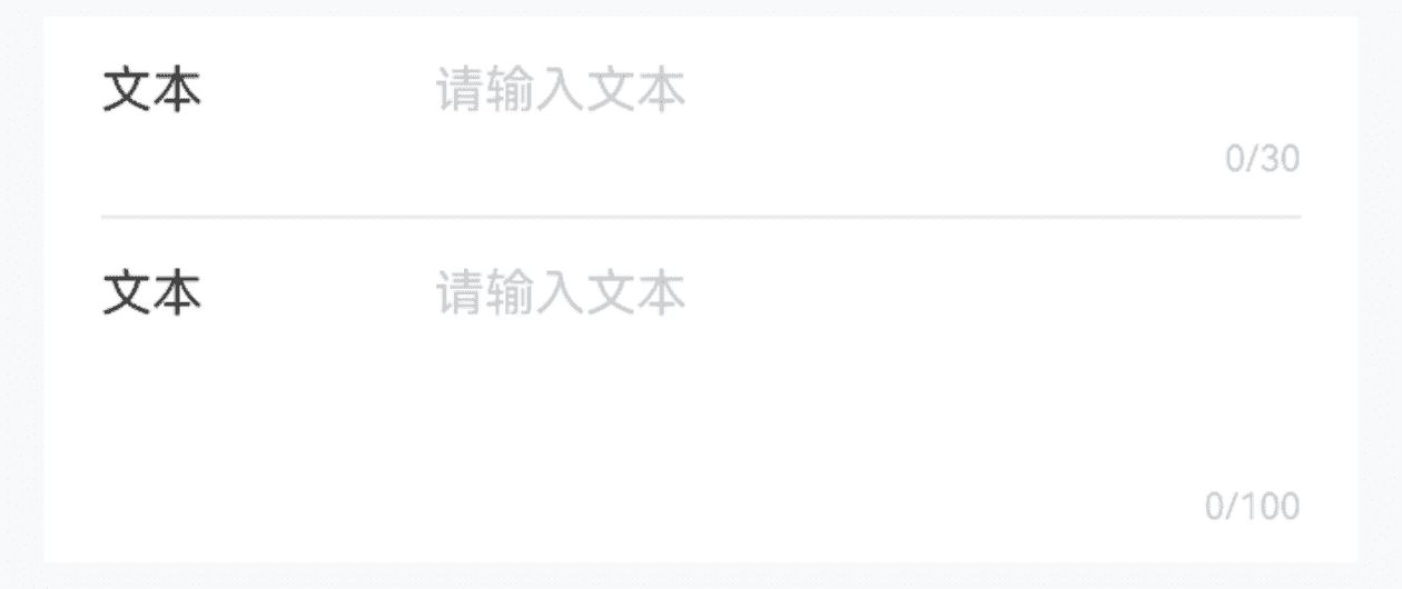
TIP
通过设置 showWordLimit 和 maxlength 属性后会在底部显示字数统计。
点我查看代码
@Entry
@Component
struct DemoPage {
  @State value1: string = ''
  @State value2: string = ''
  build() {
    Column(){
      IBestField({
        value: $value1,
        label: "文本",
        placeholder: "请输入文本",
        maxlength: 30,
        clearable: true,
        showWordLimit: true
      })
      IBestField({
        value: $value2,
        label: "文本",
        placeholder: "请输入文本",
        hasBorder: false,
        autosize: true,
        rows: 3,
        maxlength: 100,
        clearable: true,
        showWordLimit: true
      })
    }
  }
}
输入框内容对齐

TIP
通过 inputAlign 属性可以设置输入框内容对齐方式, 默认为 left。
点我查看代码
@Entry
@Component
struct DemoPage {
  @State value: string = ''
  build() {
    Column(){
      IBestField({
        value: $value,
        label: "文本",
        placeholder: "输入框内容右对齐",
        hasBorder: false,
        inputAlign: "right"
      })
    }
  }
}
输入框文本位置
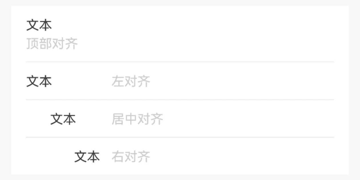
TIP
通过 labelPosition 属性可以设置文本位置, 默认为 left; 通过 labelAlign 属性可以设置文本对齐方式, 默认为 left。
点我查看代码
@Entry
@Component
struct DemoPage {
  @State value1: string = ''
  @State value2: string = ''
  @State value3: string = ''
  @State value4: string = ''
  build() {
    Column(){
      IBestField({
        value: $value1,
        label: "文本",
        placeholder: "顶部对齐",
        labelPosition: "top"
      })
      IBestField({
        value: $value2,
        label: "文本",
        placeholder: "左对齐",
        labelAlign: "left"
      })
      IBestField({
        value: $value3,
        label: "文本",
        placeholder: "居中对齐",
        labelAlign: "center"
      })
      IBestField({
        value: $value4,
        label: "文本",
        placeholder: "右对齐",
        labelAlign: "right",
        hasBorder: false
      })
    }
  }
}
点击反馈

TIP
通过 clickable isLink 属性可以开启点击反馈。
点我查看代码
@Entry
@Component
struct DemoPage {
  @State value: string = ''
  build() {
    Column(){
      IBestField({
        value: $value,
        label: "地区",
        placeholder: "点击选择地区",
        hasBorder: false,
        isLink: true,
        onFieldClick: () => {
          console.log("点击")
        }
      })
    }
  }
}
自定义右侧区域内容
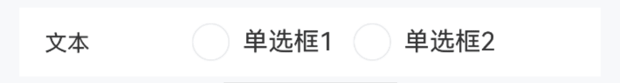
TIP
通过 customRightContent 插槽可自定义右侧内容。
点我查看代码
import { IBestRadioGroup, IBestRadio } from "@ibestservices/ibest-ui";
@Entry
@Component
struct DemoPage {
  @State value: string = ''
  @Builder radioContent() {
    IBestRadioGroup({
      group: 'group1',
      onChange: val => {
        console.log('group1', val)
      }
    })
    Flex({ wrap: FlexWrap.Wrap, space: { main: 10 } }){
      IBestRadio({
        label: '单选框1',
        name: '1',
        group: 'group1'
      })
      IBestRadio({
        label: '单选框2',
        name: '2',
        group: 'group1'
      })
    }
    .width("100%")
  }
  build() {
    Column(){
      IBestField({
        value: $value,
        label: "文本",
        hasBorder: false,
        customRightContent: (): void => this.radioContent()
      })
    }
  }
}
边框样式
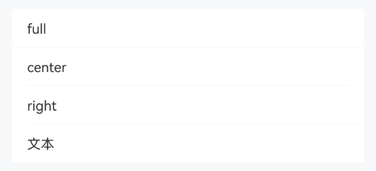
TIP
通过 borderSizeType 属性可自定义底部边框线位置。
点我查看代码
@Entry
@Component
struct DemoPage {
  @State value: string = ''
  build() {
    Column(){
      IBestField({
        value: $value,
        label: "full",
        readOnly: true,
        borderSizeType: 'full'
      })
      IBestField({
        value: $value,
        label: "center",
        readOnly: true,
        borderSizeType: 'center'
      })
      IBestField({
        value: $value,
        label: "right",
        readOnly: true,
        borderSizeType: 'right'
      })
      IBestField({
        value: $value,
        label: "文本",
        readOnly: true,
        hasBorder: false
      })
    }
  }
}
API
@Props
| 参数 | 说明 | 类型 | 默认值 |
|---|---|---|---|
| type | 输入框类型, autosize 为true时, 可选值 normal password email number phone username number-password decimal ; autosize 为false时, 可选值 normal email number phone decimal, 其他无效 | string | 'normal' |
| value | 当前输入的值, 支持双向绑定 | string | number | boolean | (string | number)[] | '' |
| formId | 唯一id, 当组件用于验证时必传 | string | number | '' |
| prop | 绑定value的属性名, 当组件用于验证时必传 | string | '' |
| required | 是否为必填项,如不设置,则会根据校验规则确认,如果设为false,则rules中带有required: true的规则不会触发验 | boolean | undefined |
| requireAsteriskPosition | 星号的位置, 可选值 left right, 可由form统一配置 | string | left |
| rules | 验证规则,优先级大于form的rules中对应的规则 | IBestFormRuleItem[] | [] |
| label | 输入框左侧文本 | ResourceStr | '' |
| colon | 是否在label后加冒号, 可由form统一配置 | boolean | false |
| labelWidth | 左侧文本宽度,可由form统一配置 | string | number | 80 |
| labelPosition | 左侧文本位置, 可选值 left top, 可由form统一配置 | string | left |
| labelAlign | 左侧文本对齐方式, 可选值 left center right, 可由form统一配置 | string | left |
| placeholder | 输入框占位提示文字 | ResourceStr | '' |
| decimalLength | 小数点位数, 仅当type为decimal时生效, 默认不限制 | number | -1 |
| showPasswordIcon | 是否显示密码框末尾图标 | boolean | true |
| autosize | 输入框自适应高度 | boolean | false |
| rows | 默认行数, 仅当 autosize 为true时生效 | number | 1 |
| maxlength | 最大输入字符数, 默认不限制 | number | -1 |
| showWordLimit | 是否显示字数统计, 需配合 maxlength 一起使用 | boolean | false |
| inputAlign | 输入框文字对齐方式, 可选值 left center right | string | left |
| disabled | 是否禁用, 可由form统一配置 | boolean | false |
| readOnly | 是否只读 | boolean | false |
| clickable | 是否开启点击反馈 | boolean | false |
| isLink | 是否展示右侧箭头并开启点击反馈 | boolean | false |
| leftIcon | 左侧图标 | ResourceStr | '' |
| leftIconColor | 左侧图标颜色, 仅svg格式有效 | ResourceColor | '' |
| rightIcon | 右侧图标 | ResourceStr | '' |
| rightIconColor | 右侧图标颜色, 仅svg格式有效 | ResourceColor | '' |
| hasBorder | 是否展示底部线条 | boolean | true |
| clearable | 是否启用清除图标,点击清除图标后会清空输入框 | boolean | false |
| clearIcon | 自定义清除图标 | ResourceStr | '' |
| clearTrigger | 显示清除图标的时机, 可选值 always focus | string | focus |
| showMessage | 是否显示验证信息, 可由form统一配置 | boolean | true |
| formatter | 格式化函数 | (value: string) => string | - |
| formatTrigger | 执行格式化函数触发时机, 可选值 onchange onblur | string | onchange |
| labelFontSize | 左侧字体大小 | string | number | 14 |
| labelColor | 左侧字体颜色 | ResourceStr | #323233 |
| leftIconSize | 左侧图标大小 | string | number | 14 |
| rightIconSize | 右侧图标大小 | string | number | 14 |
| showLabel | 是否显示label | boolean | true |
| placeholderColor | 占位文字颜色 | ResourceColor | #c8c9cc |
| bgColor | 背景色 | ResourceColor | #fff |
| inputFontSize | 输入框字体大小 | string | number | 14 |
| caretColor | 光标颜色 | ResourceColor | '' |
| min | 最小值, type 为 number decimal 时有效 | number | -1 |
| max | 最大值, type 为 number decimal 时有效 | number | -1 |
| verticalAlign | 垂直方向对齐方式, 仅 labelPosition 为left时有效, 可选值 top center | string | 'top' |
| radius | 外部圆角 | Length | BorderRadiuses | LocalizedBorderRadiuses | 0 |
| prefix | 前缀内容 | ResourceStr | '' |
| prefixFontColor | 前缀内容颜色 | ResourceColor | #969799 |
| suffix | 后缀内容 | ResourceStr | '' |
| suffixFontColor | 后缀内容颜色 | ResourceColor | #969799 |
| messageTextAlign | 验证信息对齐方式, 可选值 left center right, 默认与输入框文字对齐方式一致 | string | left |
| inputFontColor | 输入框文字颜色 | ResourceColor | #323233 |
| prefixIcon | 前缀图标, 优先级高于prefix | ResourceStr | '' |
| prefixSize | 前缀内容大小 | string | number | 14 |
| suffixIcon | 后缀图标, 优先级高于suffix | ResourceStr | '' |
| suffixSize | 后缀内容大小 | string | number | 14 |
| borderSizeType | 底部边框线尺寸类型, 可选值 full center right | string | center |
| borderLeft | 底部边框线左侧left值 | Dimension | - |
| fieldPadding | 输入框内边距 | Length | Padding | LocalizedPadding | {left: 16, right: 16, top: 10, bottom: 10} |
| bdColor | 底部边框线颜色 | ResourceColor | #ebedf0 |
| showValue | 右侧要显示的内容,当右侧需要显示的内容与value不同时可使用该属性,仅autosize为false且disabled | readOnly | isLink为true时生效 | ResourceStr | '' |
| inputFilter | 过滤器 | ResourceStr | '' |
Events
| 事件名 | 说明 | 事件类型 |
|---|---|---|
| onChange | value变化时触发 | (value: string | number | boolean | (string | number | IBestUploaderFile)[]) => void |
| onClear | 点击清除按钮时触发 | () => void |
| onFieldClick | 点击组件时触发 | () => void |
| onFieldFocus | 输入框获得焦点时触发 | () => void |
| onFieldBlur | 输入框失去焦点时触发 | () => void |
| onLeftIconClick | 左侧图标点击时触发 | () => void |
| onRightIconClick | 右侧图标点击时触发 | () => void |
插槽
| 插槽名 | 说明 | 类型 |
|---|---|---|
| buttonBuilder | 右侧按钮 | CustomBuilder |
| customRightContent | 右侧内容, 使用该插槽后, 与输入框相关的属性和事件将失效 | CustomBuilder |
主题定制
组件提供了下列颜色变量,可用于自定义深色/浅色模式样式,使用方法请参考 颜色模式 章节,如需要其它颜色变量可提 issue。
| 名称 | 描述 | 默认值 |
|---|---|---|
| ibest_field_label_color | 标签文字颜色 | #323233 |
| ibest_field_input_color | 输入框文字颜色 | #323233 |
| ibest_field_placeholder_color | 输入框占位文字颜色 | #c8c9cc |
| ibest_field_right_icon_color | 右侧图标颜色 | #969799 |
| ibest_field_border_color | 边框颜色 | #ebedf0 |
| ibest_field_background | 背景颜色 | #fff |
| ibest_field_active_color | 按压态背景颜色 | #f2f3f5 |
| ibest_field_prefix_font_color | 前缀内容颜色 | #969799 |
| ibest_field_suffix_font_color | 后缀内容颜色 | #969799 |