Mosaic 马赛克
介绍
用于将一块内容进行马赛克处理。
TIP
阅读该组件文档前请确保已认真阅读快速上手章节的每一个字。
引入
ts
import { IBestMosaic } from "@ibestservices/ibest-ui";代码演示
基础用法
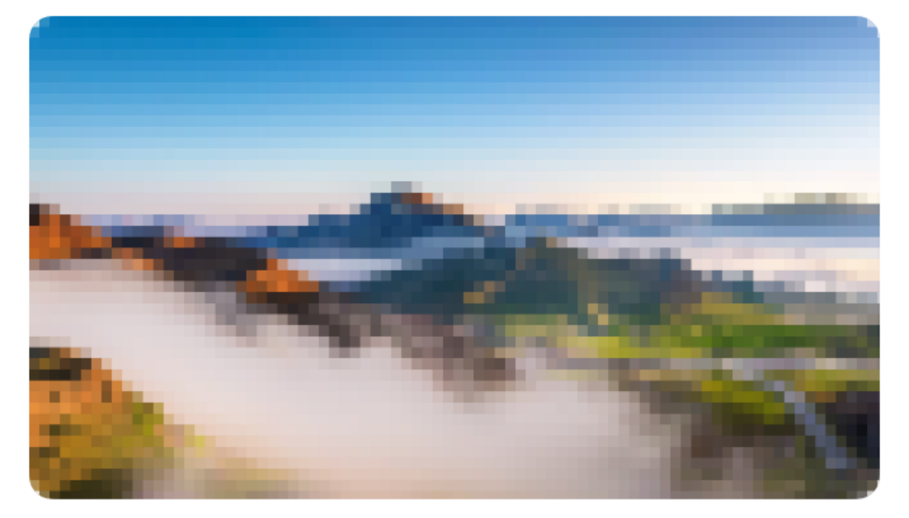
TIP
若内容部分包含圆角,请手动设置radius属性。
点我查看代码
ts
@Entry
@Component
struct DemoPage {
  @Builder imgMosaicBuilder(){
    Image("https://gips2.baidu.com/it/u=229998344,1431847233&fm=3074&app=3074&f=PNG?w=2560&h=1440")
      .width("100%")
      .height(200)
      .borderRadius(10)
  }
  build() {
    Column() {
      IBestMosaic({radius: 10}){
        this.imgMosaicBuilder()
      }
    }
  }
}
自定义马赛克块大小
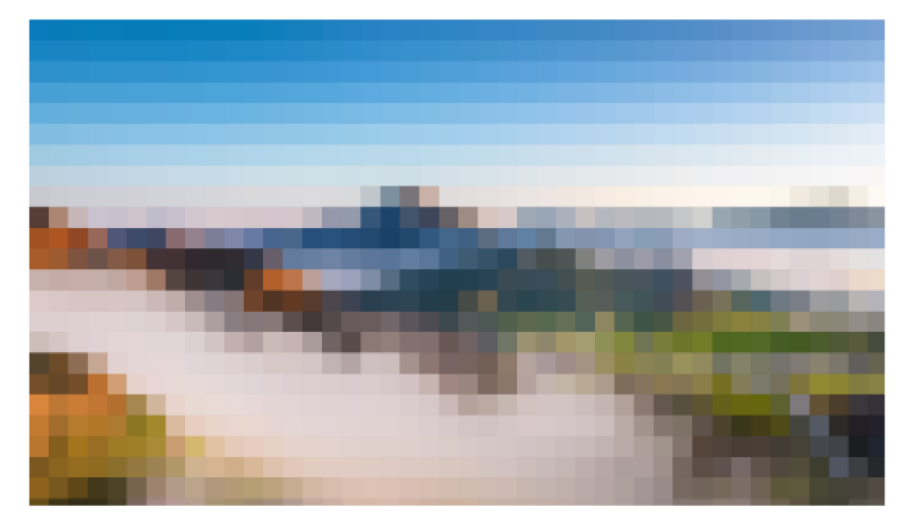
点我查看代码
ts
@Entry
@Component
struct DemoPage {
  @Builder imgMosaicBuilder(){
    Image("https://gips2.baidu.com/it/u=229998344,1431847233&fm=3074&app=3074&f=PNG?w=2560&h=1440")
      .width("100%")
      .height(200)
  }
  build() {
    Column() {
      IBestMosaic({ blockSize: 30 }){
        this.imgMosaicBuilder()
      }
    }
  }
}
模糊文字
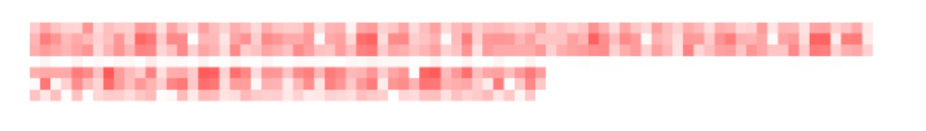
点我查看代码
ts
@Entry
@Component
struct DemoPage {
  @Builder contentBuilder(){
    Column(){
      Text("测试马赛克文字测试马赛克文字测试马赛克文字测试马赛克文字测试马赛克文字测试马赛克文字")
        .fontSize(14)
        .fontColor("red")
    }
    .width("100%")
    .alignItems(HorizontalAlign.Start)
  }
  build() {
    Column() {
      IBestMosaic(){
        this.contentBuilder()
      }
    }
  }
}
动态显示
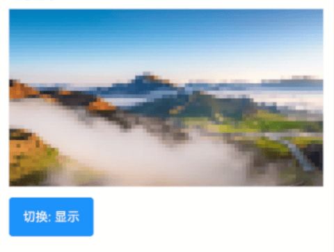
点我查看代码
ts
@Entry
@Component
struct DemoPage {
  @State showMosaic: boolean = true
  @Builder imgMosaicBuilder(){
    Image("https://gips2.baidu.com/it/u=229998344,1431847233&fm=3074&app=3074&f=PNG?w=2560&h=1440")
      .width("100%")
      .height(200)
  }
  build() {
    Column() {
      IBestMosaic({ showMosaic: this.showMosaic }){
        this.imgMosaicBuilder()
      }
      IBestButton({
        type: "primary",
        text: `切换: ${this.showMosaic ? "显示" : "隐藏"}`,
        onBtnClick: () => {
          this.showMosaic = !this.showMosaic
        }
      })
    }
  }
}
API
@Props
| 参数 | 说明 | 类型 | 默认值 |
|---|---|---|---|
| showMosaic | 是否展示马赛克 | boolean | true |
| delay | 生成马赛克的延迟时长,单位ms,若在使用中马赛克无法正常显示,可设置更长的延迟时长 | number | 300 |
| blockSize | 马赛克块大小 | number | 16 |
| syncShow | 是否同步展示马赛克,即马赛克与内容同步展示 | boolean | true |
| bgColor | 内容区域背景色 | ResourceColor | #fff |
| radius | 圆角,当内容部分含有圆角时,请设置该属性 | Length | BorderRadiuses | LocalizedBorderRadiuses | 0 |
插槽
| 插槽名 | 说明 | 类型 |
|---|---|---|
| defaultBuilder | 默认内容的插槽 | CustomBuilder |