NavBar 导航栏
介绍
为页面提供导航功能,常用于页面顶部。
TIP
阅读该组件文档前请确保已认真阅读快速上手章节的每一个字。
引入
ts
import { IBestNavBar } from "@ibestservices/ibest-ui";代码演示
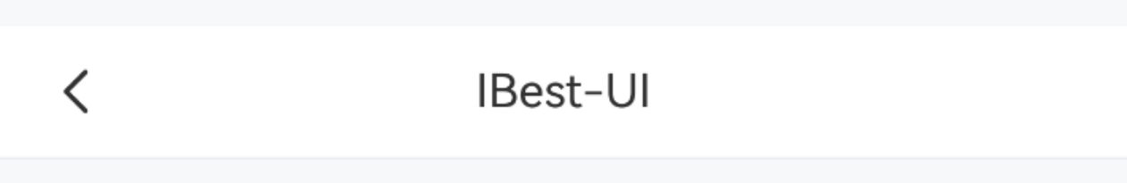
基础用法
点我查看代码
ts
@Entry
@Component
struct DemoPage {
build() {
Column(){
IBestNavBar({
title: "IBest-UI"
})
}
}
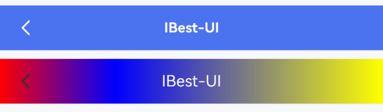
}自定义样式
点我查看代码
ts
@Entry
@Component
struct DemoPage {
  build() {
    Column({space: 14}){
      IBestNavBar({
        title: "IBest-UI",
        titleColor: "#fff",
        titleFontSize: 14,
        titleFontWeight: FontWeight.Bold,
        navBarBgColor: "#476ce3",
        leftIconColor: "#fff"
      })
      IBestNavBar({
        title: "IBest-UI",
        titleColor: "#fff",
        bgLinearGradient: {
          angle: 90,
          colors: [[0xff0000, 0.0], [0x0000ff, 0.3], [0xffff00, 1.0]]
        }
      })
    }
  }
}
标题居左
点我查看代码
ts
@Entry
@Component
struct DemoPage {
build() {
Column(){
IBestNavBar({
title: "IBest-UI",
titleTextAlign: "left"
})
}
}
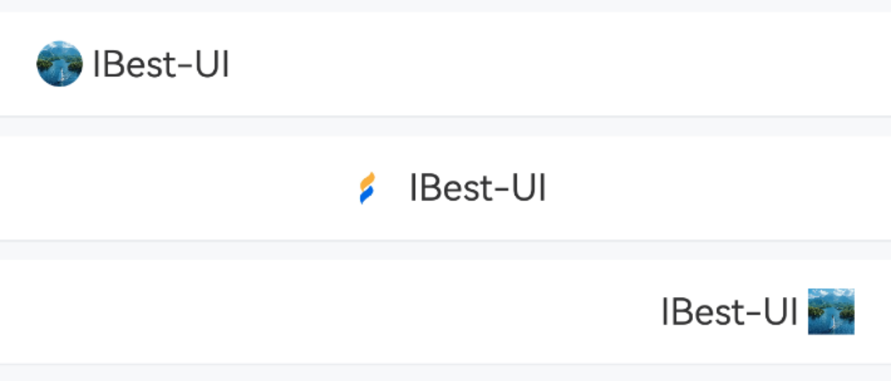
}自定义显示区域
点我查看代码
ts
@Entry
@Component
struct DemoPage {
  build() {
    Column({space: 14}){
      IBestNavBar({
        leftIcon: "https://img1.baidu.com/it/u=498751481,2849377151&fm=253&fmt=auto&app=138&f=JPEG?w=800&h=800",
        leftLabel: "IBest-UI",
        leftIconRadius: 999
      })
      IBestNavBar({
        isShowLeft: false,
        title: "IBest-UI",
        titleIcon: $r("app.media.app_icon"),
      })
      IBestNavBar({
        isShowLeft: false,
        isShowRight: true,
        rightIcon: "https://img1.baidu.com/it/u=498751481,2849377151&fm=253&fmt=auto&app=138&f=JPEG?w=800&h=800",
        rightLabel: "IBest-UI"
      })
    }
  }
}
自定义标题内容
点我查看代码
ts
@Entry
@Component
struct DemoPage {
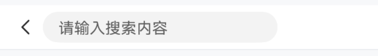
@Builder titleBuilder(){
TextInput({text: this.searchVal, placeholder: "请输入搜索内容"}).width("70%").height("70%")
}
build() {
Column(){
IBestNavBar({
titleBuilder: (): void => this.titleBuilder()
})
}
}
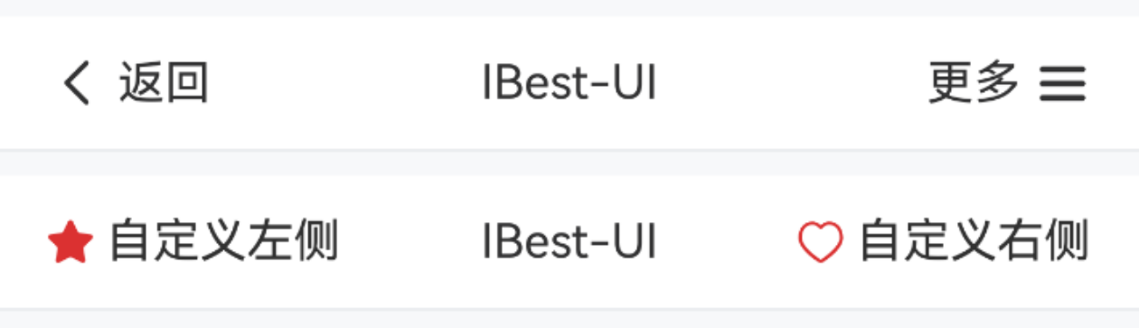
}自定义左右内容
点我查看代码
ts
@Entry
@Component
struct DemoPage {
@Builder leftBuilder(){
Row({space: 14}){
Image($r("app.media.icon_star_o"))
.width(16)
Text("自定义左侧")
}
}
@Builder rightBuilder(){
Row({space: 14}){
Image($r("app.media.icon_like"))
.width(16)
Text("自定义右侧")
}
}
build() {
Column({space: 14}) {
IBestNavBar({
title: "IBest-UI",
leftLabel: "返回",
isShowRight: true,
rightIcon: "wap-nav",
rightLabel: "更多"
})
IBestNavBar({
title: "IBest-UI",
leftBuilder: (): void => this.leftBuilder(),
isShowRight: true,
rightBuilder: (): void => this.rightBuilder()
})
}
}
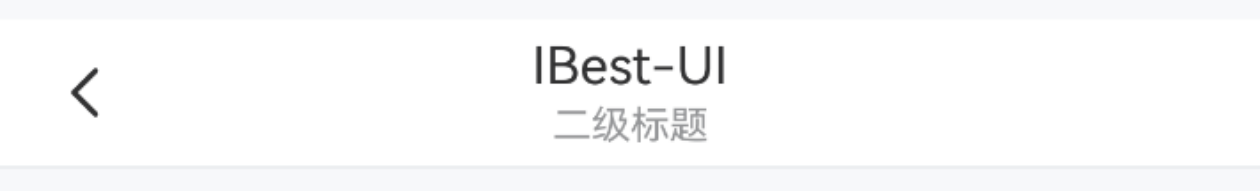
}二级标题
点我查看代码
ts
@Entry
@Component
struct DemoPage {
build() {
Column(){
IBestNavBar({
title: "IBest-UI",
subTitle: "一套轻量、可定制化主题的鸿蒙UI组件库"
})
}
}
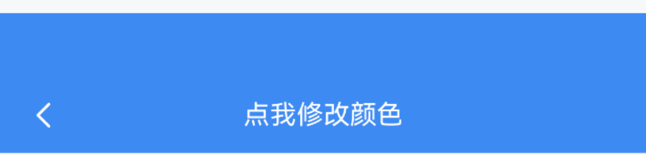
}显示状态栏
点我查看代码
ts
@Entry
@Component
struct DemoPage {
  @State navBarBgColor: string = "#3D8AF2"
  getRandomColor(): string {
    return '#' + Math.floor(Math.random()*16777215).toString(16).padStart(6, '0')
  }
  build() {
    Column(){
      IBestNavBar({
        title: "点我修改颜色",
        titleColor: "#fff",
        leftIconColor: "#fff",
        navBarBgColor: this.navBarBgColor,
        isShowStatusBar: true,
        onTitleClick: () => {
          this.navBarBgColor = this.getRandomColor()
        }
      })
    }
  }
}
API
@Props
| 参数 | 说明 | 类型 | 默认值 |
|---|---|---|---|
| navBarHeight | 导航栏高度 | string | number | 46 |
| navBarBgColor | 导航栏背景颜色 | ResourceColor | #fff |
| bgLinearGradient | 导航栏渐变背景色, 优先级高于navBarBgColor | LinearGradient | - |
| leftRightPadding | 导航栏左右内边距 | number | 16 |
| isShowBorder | 是否显示下边框线 | boolean | true |
| title | 标题文字 | ResourceStr | '' |
| titleColor | 标题文字颜色 | ResourceColor | #323233 |
| titleFontSize | 标题文字大小 | string | number | 16 |
| titleIcon | 标题图标 | ResourceStr | '' |
| titleIconColor | 标题图标颜色 | ResourceColor | #323233 |
| titleIconSize | 标题图标大小 | string | number | 20 |
| titleIconRadius | 标题图标圆角 | string | number | 0 |
| titleFontWeight | 标题字重 | FontWeight | 600 |
| subTitle | 副标题文字 | ResourceStr | '' |
| subTitleColor | 副标题文字颜色 | ResourceColor | #969799 |
| subTitleFontSize | 副标题文字大小 | string | number | 12 |
| isShowLeft | 是否显示左侧内容 | boolean | true |
| leftIcon | 自定义左侧图标 | ResourceStr | arrow-left |
| leftIconColor | 左侧图标颜色 | ResourceColor | #323233 |
| leftIconSize | 左侧图标大小 | string | number | 20 |
| leftIconRadius | 左侧图标圆角 | string | number | 0 |
| leftLabel | 左侧文字 | ResourceStr | '' |
| leftLabelColor | 左侧文字颜色 | ResourceColor | #323233 |
| leftLabelFontSize | 左侧文字大小 | string | number | 16 |
| isShowRight | 是否显示右侧 | boolean | false |
| rightIcon | 自定义右侧图标 | ResourceStr | '' |
| rightIconColor | 右侧图标颜色 | ResourceColor | #323233 |
| rightIconSize | 右侧图标大小 | string | number | 20 |
| rightIconRadius | 右侧图标圆角 | string | number | 0 |
| rightLabel | 右侧文字 | ResourceStr | '' |
| rightLabelColor | 右侧文字颜色 | ResourceColor | #323233 |
| rightLabelFontSize | 右侧文字大小 | string | number | 16 |
| isShowStatusBar | 是否显示状态栏 | boolean | false |
| statusBarBgColor | 状态栏背景色, 默认与导航栏背景色一致 | ResourceColor | #fff |
| isKeepBgColorSame | 是否保持与导航栏背景色一致,默认为是,即状态栏背景色会跟随导航栏背景色变化 | boolean | true |
| titleTextAlign | 标题文字对齐方式, 可选值 left center | string | center |
| expandSafeAreaType | 导航栏扩展区域类型 | SafeAreaType[] | [SafeAreaType.SYSTEM, SafeAreaType.CUTOUT] |
Events
| 事件名 | 说明 | 事件类型 |
|---|---|---|
| onLeftClick | 点击左侧内容区域回调 | () => void |
| onRightClick | 点击右侧内容区域回调 | () => void |
| onTitleClick | 点击标题区域回调 | () => void |
插槽
| 插槽名 | 说明 | 类型 |
|---|---|---|
| leftBuilder | 自定义左侧内容 | CustomBuilder |
| rightBuilder | 自定义右侧内容 | CustomBuilder |
| titleBuilder | 自定义标题内容 | CustomBuilder |
主题定制
组件提供了下列颜色变量,可用于自定义深色/浅色模式样式,使用方法请参考 颜色模式 章节,如需要其它颜色变量可提 issue。
| 名称 | 描述 | 默认值 |
|---|---|---|
| ibest_navbar_background | 标题栏背景色 | #fff |
| ibest_navbar_sub_title_text_color | 副标题文字颜色 | #969799 |
| ibest_navbar_border_color | 边框颜色 | #ebedf0 |