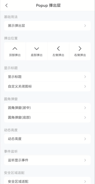
Popup 弹出层
介绍
弹出层容器,用于展示弹窗、信息提示等内容,支持多个弹出层叠加展示。
TIP
阅读该组件文档前请确保已认真阅读快速上手章节的每一个字。
引入
ts
import { IBestPopup } from "@ibestservices/ibest-ui";代码演示
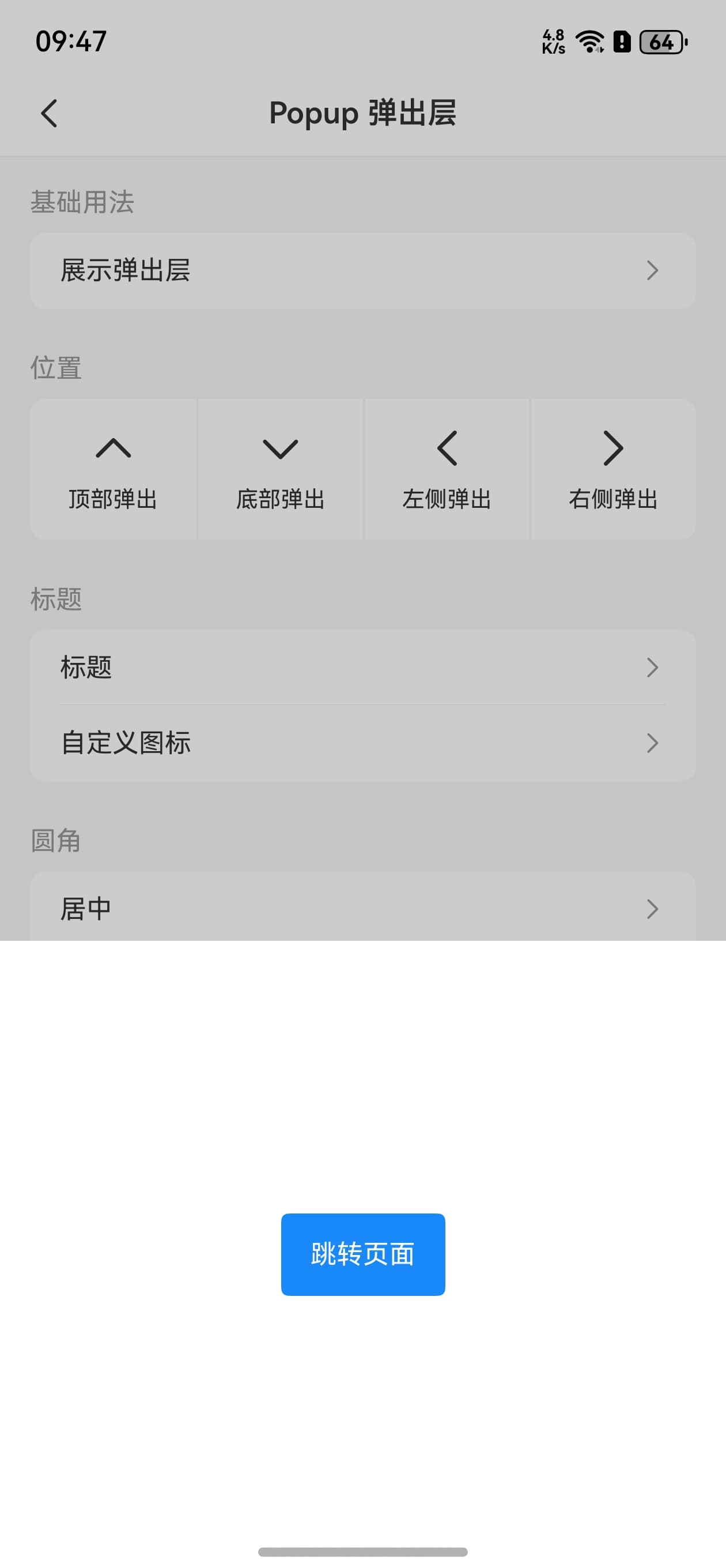
基础用法
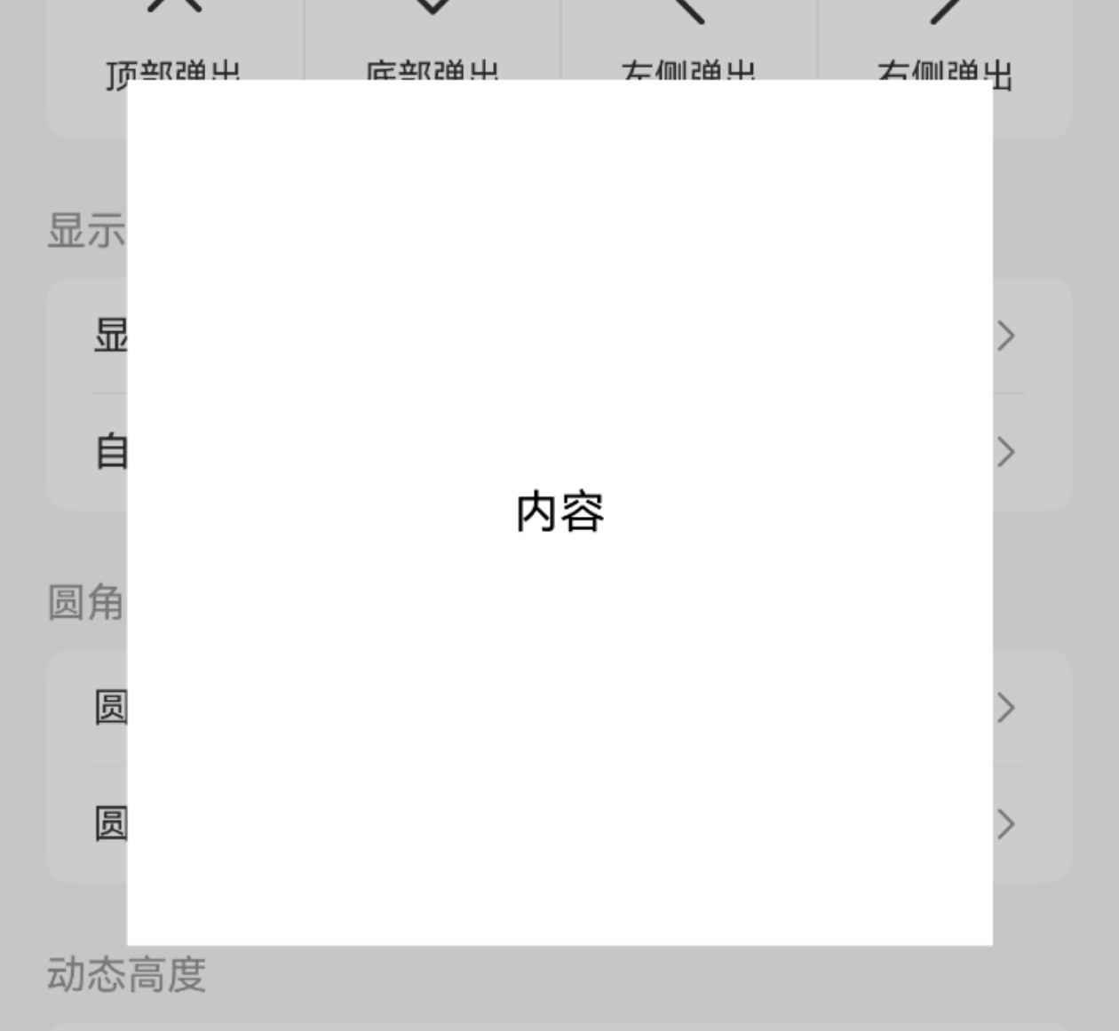
TIP
通过 visible 属性可控制弹出层是否显示。
点我查看代码
ts
import { IBestCell } from "@ibestservices/ibest-ui"
@Entry
@Component
struct DemoPage {
  @State visible: boolean = false
  @Builder centerBuilder() {
    Row() {
      Text("内容")
    }
    .width("100%")
    .aspectRatio(1)
    .justifyContent(FlexAlign.Center)
  }
  build() {
    Column(){
      IBestCell({
        title: '展示弹出层',
        isLink: true,
        hasBorder: false,
        onCellClick: () => {
          this.visible = true
        }
      })
      IBestPopup({
        visible: $visible,
        popupWidth: 300,
        contentBuilder: (): void => this.centerBuilder()
      })
    }
  }
}
弹出位置

TIP
通过 popupAlign 属性可设置弹出位置,支持 top、bottom、left、right 四种弹出位置,默认为 center。
• 当弹窗从顶部或底部弹出时,默认宽度与屏幕宽度保持一致,弹窗高度默认40%。
• 当弹窗从左侧或右侧弹出时,默认高度与屏幕高度保持一致,弹窗宽度默认60%。
• 当弹窗从中间弹出时,默认不设置宽高,弹窗的宽高取决于内容的宽高。
点我查看代码
ts
import { IBestCellGroup } from "@ibestservices/ibest-ui"
@Extend(Column) function positionColStyle(bd: boolean = false){
.layoutWeight(1)
.height(75)
.justifyContent(FlexAlign.Center)
.border({width:{left: bd ? 1 : 0}, color: "#ebedf0"})
}
@Entry
@Component
struct DemoPage {
@State upVisible: boolean = false
@State downVisible: boolean = false
@State leftVisible: boolean = false
@State rightVisible: boolean = false
build() {
Column(){
IBestCellGroup({ inset: true }) {
Row(){
Column(){
Text("顶部弹出")
.fontSize(14)
}
.positionColStyle()
.onClick(() => {
this.upVisible = true
})
Column(){
Text("底部弹出")
.fontSize(14)
}
.positionColStyle(true)
.onClick(() => {
this.downVisible = true
})
Column(){
Text("左侧弹出")
.fontSize(14)
}
.positionColStyle(true)
.onClick(() => {
this.leftVisible = true
})
Column(){
Text("右侧弹出")
.fontSize(14)
}
.positionColStyle(true)
.onClick(() => {
this.rightVisible = true
})
}
.width("100%")
.backgroundColor("#fff")
}
IBestPopup({
visible: $upVisible,
popupAlign: "top"
})
IBestPopup({
visible: $downVisible,
popupAlign: "bottom"
})
IBestPopup({
visible: $leftVisible,
popupAlign: "left"
})
IBestPopup({
visible: $rightVisible,
popupAlign: "right"
})
}
}
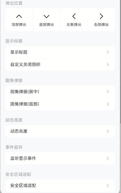
}显示标题
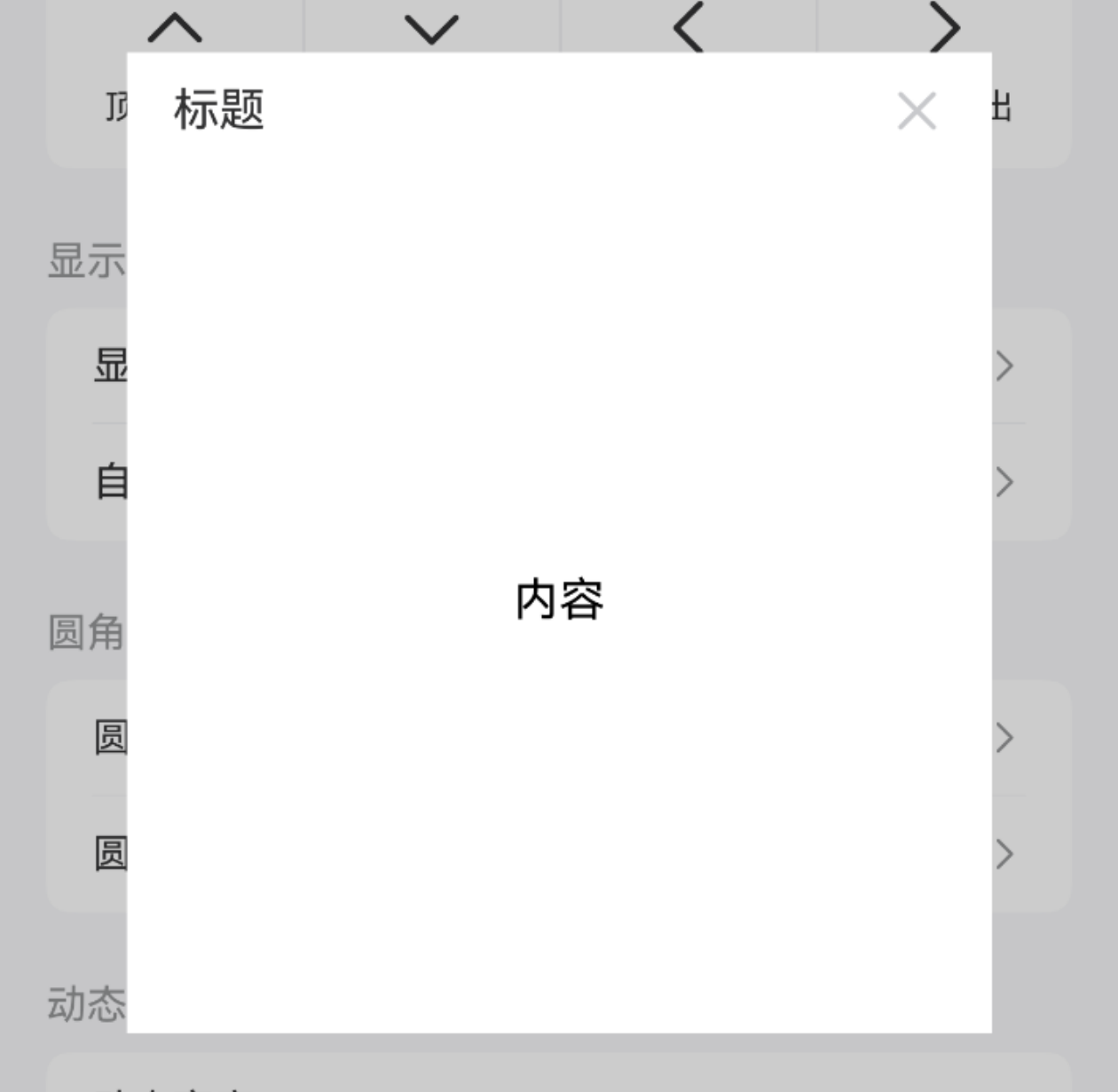
TIP
通过 isShowHeader 属性可控制标题显示,title 属性可设置标题内容,closeIcon 属性可自定义关闭图标。
点我查看代码
ts
import { IBestCellGroup, IBestCell } from "@ibestservices/ibest-ui"
@Entry
@Component
struct DemoPage {
  @State visible1: boolean = false
  @State visible2: boolean = false
  @Builder centerBuilder() {
    Row() {
      Text("内容")
    }
    .width("100%")
    .aspectRatio(1)
    .justifyContent(FlexAlign.Center)
  }
  build() {
    Column(){
      IBestCellGroup({ inset: true }) {
        Column() {
          IBestCell({
            title: '显示标题',
            isLink: true,
            onCellClick: () => {
              this.visible1 = true
            }
          })
          IBestCell({
            title: '自定义关闭图标',
            isLink: true,
            hasBorder: false,
            onCellClick: () => {
              this.visible2 = true
            }
          })
        }
      }
      IBestPopup({
        visible: $visible1,
        popupWidth: 300,
        cornerRadius: 20,
        isShowHeader: true,
        title: "标题",
        contentBuilder: (): void => this.centerBuilder()
      })
      IBestPopup({
        visible: $visible2,
        popupAlign: "bottom",
        isShowHeader: true,
        title: "标题",
        closeIcon: "https://ibestui.ibestservices.com/favicon.ico"
      })
    }
  }
}
圆角弹窗
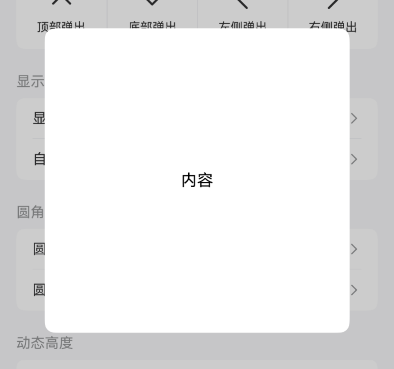
TIP
通过 cornerRadius 属性可设置弹窗圆角。
点我查看代码
ts
import { IBestCellGroup, IBestCell } from "@ibestservices/ibest-ui"
@Entry
@Component
struct DemoPage {
@State visible1: boolean = false
@State visible2: boolean = false
@Builder centerBuilder() {
Row() {
Text("内容")
}
.width(150)
.aspectRatio(1)
.justifyContent(FlexAlign.Center)
}
build() {
Column(){
IBestCellGroup({ inset: true }) {
Column() {
IBestCell({
title: '圆角弹窗(居中)',
isLink: true,
onCellClick: () => {
this.visible1 = true
}
})
IBestCell({
title: '圆角弹窗(底部)',
isLink: true,
hasBorder: false,
onCellClick: () => {
this.visible2 = true
}
})
}
}
IBestPopup({
visible: $visible1,
popupWidth: 300,
cornerRadius: 10,
contentBuilder: (): void => this.centerBuilder()
})
IBestPopup({
visible: $visible2,
popupAlign: "bottom",
cornerRadius: 30
})
}
}
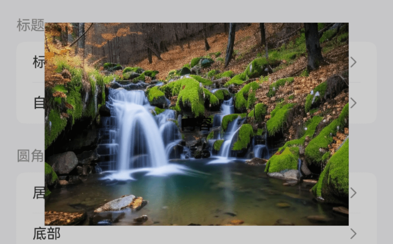
}背景图片
点我查看代码
ts
import { IBestCell } from "@ibestservices/ibest-ui"
@Entry
@Component
struct DemoPage {
  @State visible: boolean = false
  @Builder centerBuilder() {
    Row() {
      Text("内容").fontColor("#fff")
    }
    .width("100%")
    .height("100%")
    .justifyContent(FlexAlign.Center)
  }
  build() {
    Column(){
      IBestCell({
        title: '背景图片',
        isLink: true,
        hasBorder: false,
        onCellClick: () => {
          this.visible = true
        }
      })
      IBestPopup({
        visible: $visible,
        popupWidth: 300,
        popupHeight: 200,
        bgImage: "https://img1.baidu.com/it/u=1502587040,2600645085&fm=253&fmt=auto&app=120&f=JPEG?w=1422&h=800",
        contentBuilder: (): void => this.centerBuilder()
      })
    }
  }
}
动态高度
点我查看代码
ts
import { IBestCell } from "@ibestservices/ibest-ui"
@Entry
@Component
struct DemoPage {
@State visible: boolean = false
@State popupHeight: number = 150
@Builder cusHeightBuilder() {
Column() {
IBestButton({
text: "切换高度",
type: "primary",
onBtnClick: () => {
this.popupHeight = this.popupHeight == 150 ? 300 : 150
}
})
}
.width("100%")
.padding(20)
.justifyContent(FlexAlign.Center)
}
build() {
Column(){
IBestCell({
title: '切换高度',
isLink: true,
onCellClick: () => {
this.visible = true
}
})
IBestPopup({
visible: $visible,
popupWidth: 300,
popupHeight: this.popupHeight,
contentBuilder: (): void => this.cusHeightBuilder()
})
}
}
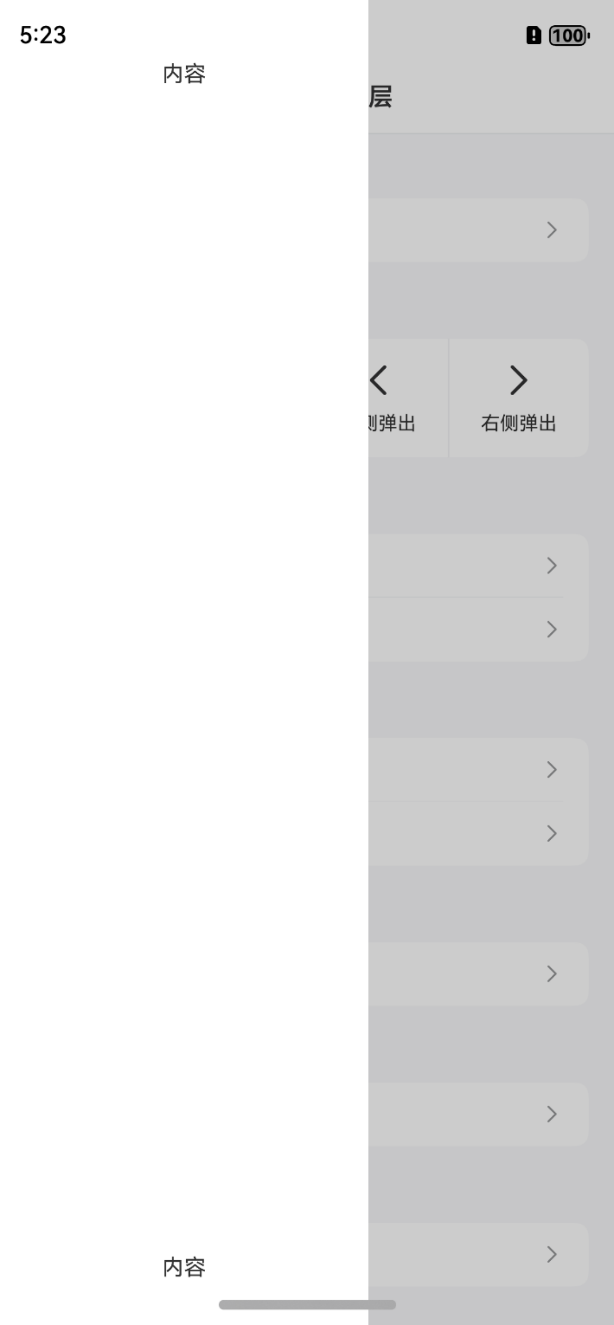
}内部跳转
点我查看代码
ts
import { IBestCell } from "@ibestservices/ibest-ui"
@Entry
@Component
struct DemoPage {
  @State visible: boolean = false
  @State uniId: number = 0
  private uiContext = this.getUIContext()
  @Builder innerBuilder(){
    Column() {
      IBestButton({
        type: 'primary',
        text: "跳转页面",
        onBtnClick: () => {
          RouterUtil.push("Button", "Button 按钮")
        }
      })
    }
    .width("100%")
    .height("100%")
    .justifyContent(FlexAlign.Center)
  }
  onDidBuild(): void {
    setTimeout(() => {
      let uniId = this.uiContext.getAttachedFrameNodeById("main")?.getUniqueId()
      if(uniId){
        this.uniId = uniId
      }
    }, 50)
  }
  build() {
    Column(){
      IBestCell({
        title: '内部跳转',
        isLink: true,
        onCellClick: () => {
          this.visible = true
        }
      })
      IBestPopup({
        visible: $visible,
        popupAlign: "bottom",
        levelMode: 1,
        levelUniqueId: this.uniId,
        contentBuilder: (): void => this.innerBuilder()
      })
    }.id("main")
  }
}
事件监听
TIP
支持以下事件:
• onOpen 弹窗打开时触发。
• onClose 弹窗关闭时触发。
点我查看代码
ts
import { IBestCell, IBestToast } from "@ibestservices/ibest-ui"
@Entry
@Component
struct DemoPage {
  @State visible: boolean = false
  build() {
    Column(){
      IBestCell({
        title: '监听显示事件',
        isLink: true,
        hasBorder: false,
        onCellClick: () => {
          this.visible = true
        }
      })
      IBestPopup({
        visible: $visible,
        popupAlign: "bottom",
        onOpen: () => {
          IBestToast.show("open")
        },
        onClose: () => {
          IBestToast.show("close")
        }
      })
    }
  }
}
安全区域适配
TIP
通过 safeAreaInsetTop 属性可设置顶部安全距离适配,safeAreaInsetBottom 属性可设置底部安全距离适配。
点我查看代码
ts
import { IBestCell } from "@ibestservices/ibest-ui"
@Entry
@Component
struct DemoPage {
  @State visible: boolean = false
  @Builder safeBuilder() {
    Column(){
      Text("内容")
    }
    .width("100%")
    .aspectRatio(1)
    .justifyContent(FlexAlign.SpaceBetween)
    .alignItems(HorizontalAlign.Center)
  }
  build() {
    Column(){
      IBestCell({
        title: '安全区域适配',
        isLink: true,
        hasBorder: false,
        onCellClick: () => {
          this.visible = true
        }
      })
      IBestPopup({
        visible: $visible,
        popupAlign: "left",
        contentBuilder: (): void => this.safeBuilder(),
        safeAreaInsetTop: true,
        safeAreaInsetBottom: true
      })
    }
  }
}
API
@Props
| 参数 | 说明 | 类型 | 默认值 |
|---|---|---|---|
| visible | 控制弹出层显示与隐藏, 支持双向绑定 | boolean | false |
| popupAlign | 弹出层位置,可选值为 left right top bottom center | string | center |
| popupWidth | 弹出层宽度,默认值请参考弹出位置事例 | string | number | - |
| popupHeight | 弹出层高度,默认值请参考弹出位置事例 | string | number | - |
| isShowHeader | 是否展示头部 | boolean | false |
| title | 标题内容 | string | '' |
| titleColor | 标题字体颜色 | ResourceColor | #323232 |
| isShowClose | 是否显示关闭图标 | boolean | true |
| closeIcon | 自定义关闭图标 | ResourceStr | '' |
| closeIconColor | 关闭图标的颜色 | ResourceColor | #c8c9cc |
| cornerRadius | 弹出层圆角值 | Length | BorderRadiuses | LocalizedBorderRadiuses | 0 |
| offsetY | 弹出层底部偏移量 | number | 0 |
| isModal | 是否为模态窗口 | boolean | true |
| maskColor | 蒙层颜色 | ResourceColor | 0x33000000 |
| closeOnClickOverlay | 是否允许点击遮罩关闭 | boolean | true |
| closeOnBackPress | 是否允许返回键关闭 | boolean | true |
| safeAreaInsetTop | 是否开启顶部安全区适配 | boolean | false |
| safeAreaInsetBottom | 是否开启底部安全区适配 | boolean | false |
| bgImage | 弹框背景图片 | ResourceStr | '' |
| bgColor | 弹框背景颜色 | ResourceColor | #fff |
| keyboardAvoidMode | 设置弹窗是否在拉起软键盘时进行自动避让 | KeyboardAvoidMode | DEFAULT |
| keyboardAvoidDistance | 弹窗避让键盘后,和键盘之间的距离 | LengthMetrics | 16vp |
| levelMode | 弹窗显示层级 | LevelMode | 0 |
| levelUniqueId | 页面级弹窗需要显示的层级下的节点 uniqueId, 仅当levelMode属性设置为LevelMode.EMBEDDED时生效 | number | - |
Events
| 事件名 | 说明 | 事件类型 |
|---|---|---|
| onOpen | 弹出层打开时触发 | () => void |
| onClose | 弹出层关闭时触发 | () => void |
插槽
| 插槽名 | 说明 | 类型 |
|---|---|---|
| headerBuilder | 自定义头部 | CustomBuilder |
| contentBuilder | 弹出层自定义内容 | CustomBuilder |
主题定制
组件提供了下列颜色变量,可用于自定义深色/浅色模式样式,使用方法请参考 颜色模式 章节,如需要其它颜色变量可提 issue。
| 名称 | 描述 | 默认值 |
|---|---|---|
| ibest_popup_background | 弹出层背景色 | #fff |
| ibest_popup_title_color | 弹出层标题文字颜色 | #323233 |
| ibest_popup_close_icon_color | 弹出层关闭图标颜色 | #c8c9cc |