Skeleton 骨架屏
介绍
用于在内容加载过程中展示一组占位图形。
TIP
阅读该组件文档前请确保已认真阅读快速上手章节的每一个字。
引入
ts
import { IBestSkeleton, IBestSkeletonParagraph } from "@ibestservices/ibest-ui";代码演示
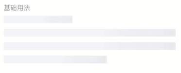
基础用法
点我查看代码
ts
@Entry
@Component
struct DemoPage {
build() {
Column(){
IBestSkeleton()
}
}
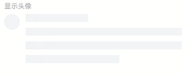
}显示头像
点我查看代码
ts
@Entry
@Component
struct DemoPage {
build() {
Column(){
IBestSkeleton({
avatar: true
})
}
}
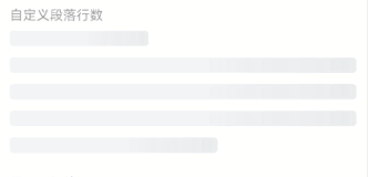
}自定义段落行数
TIP
显示的数量会比传入的数量多 1,首行会被渲染一个长度 40% 的段首。
点我查看代码
ts
@Entry
@Component
struct DemoPage {
build() {
Column(){
IBestSkeleton({
rows: 4,
radius: 4
})
}
}
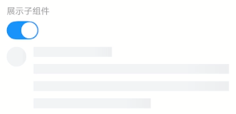
}展示子组件
点我查看代码
ts
import { IBestSwitch } from "@ibestservices/ibest-ui";
@Entry
@Component
struct DemoPage {
  @State loading: boolean = true
  build() {
    Column({ space: 12}){
      IBestSwitch({
        value: $loading
      })
      IBestSkeleton({
        avatar: true,
        loading: this.loading
      }){
        Row({space: 12}){
          Image($r("app.media.app_icon")).width(32).aspectRatio(1)
          Column({space: 12}){
            Text("关于IBest-UI")
            Text("一个轻量、简单易用、可定制主题、支持深色模式和浅色模式的鸿蒙开源UI组件库。)
          }
          .layoutWeight(1)
          .alignItems(HorizontalAlign.Start)
        }.alignItems(VerticalAlign.Top)
      }
    }
    .alignItems(HorizontalAlign.Start)
  }
}
自定义排版
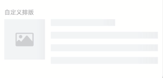
点我查看代码
ts
@Entry
@Component
struct DemoPage {
  build() {
    Row({space: 14}){
      IBestSkeletonParagraph({type: "image"})
      Column({space: 14}){
        IBestSkeletonParagraph({type: "text", rowWidth: "60%"})
        IBestSkeletonParagraph()
        IBestSkeletonParagraph()
        IBestSkeletonParagraph()
      }
      .layoutWeight(1)
      .alignItems(HorizontalAlign.Start)
    }
    .alignItems(VerticalAlign.Top)
  }
}
API
IBestSkeleton @Props
| 参数 | 说明 | 类型 | 默认值 |
|---|---|---|---|
| rows | 段落占位图行数 | number | 3 |
| avatar | 是否显示头像占位图 | boolean | false |
| animated | 是否使用动画 | boolean | true |
| radius | 圆角, circle类型无效 | string | number | 0 |
| loading | 加载 | boolean | true |
IBestSkeleton 插槽
| 插槽名 | 说明 | 类型 |
|---|---|---|
| defaultBuilder | 要显示的自定义内容 | CustomBuilder |
IBestSkeletonParagraph @Props
| 参数 | 说明 | 类型 | 默认值 |
|---|---|---|---|
| type | 占位图类型, 可选值 text、avatar、circle、image | string | text |
| rowWidth | 占位图宽度, type为 text 时默认 100%, type为 image 时默认 96, 其他类型默认 32 | string | number | - |
| rowHeight | 占位图高度, 仅type为text时有效 | string | number | 16 |
| radius | 圆角, circle类型无效 | string | number | 0 |
| animated | 是否使用动画 | boolean | true |