TabBar 标签栏
介绍
底部导航栏,用于在不同页面之间进行切换。
TIP
阅读该组件文档前请确保已认真阅读快速上手章节的每一个字。
引入
ts
import {IBestTabBar, IBestTabBarItem} from "@ibestservices/ibest-ui"代码演示
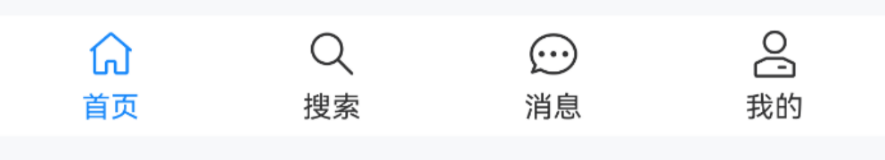
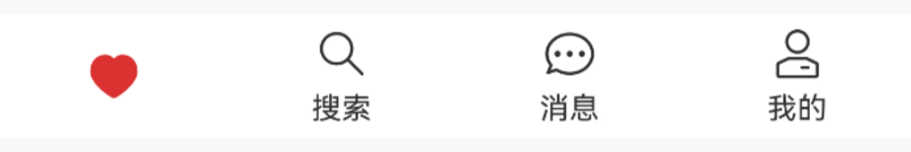
基本用法
点我查看代码
ts
@Entry
@Component
struct DemoPage {
@State groupId: string = 'tabBar'
@State active: number = 0
build() {
Column(){
IBestTabBar({ groupId: this.groupId, active: $active, onChange: active => {
console.log(active.toString())
} }){
IBestTabBarItem({ groupId: this.groupId, icon: 'wap-home-o', text: "首页" })
IBestTabBarItem({ groupId: this.groupId, icon: 'search', text: "搜索" })
IBestTabBarItem({ groupId: this.groupId, icon: 'chat-o', text: "消息" })
IBestTabBarItem({ groupId: this.groupId, icon: 'manager-o', text: "我的" })
}
}
}
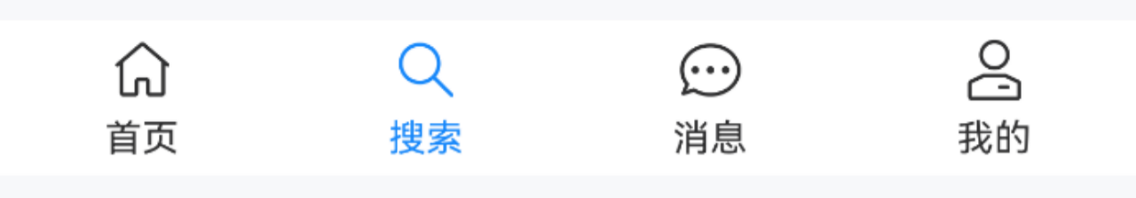
}通过名称匹配
点我查看代码
ts
@Entry
@Component
struct DemoPage {
  @State groupId: string = 'tabBar'
  @State active: string = "search"
  build() {
    Column(){
      IBestTabBar({ groupId: this.groupId, active: $active }){
        IBestTabBarItem({ groupId: this.groupId, icon: 'wap-home-o', text: "首页", name: "home" })
        IBestTabBarItem({ groupId: this.groupId, icon: 'search', text: "搜索", name: "search" })
        IBestTabBarItem({ groupId: this.groupId, icon: 'chat-o', text: "消息", name: "message" })
        IBestTabBarItem({ groupId: this.groupId, icon: 'manager-o', text: "我的", name: "my" })
      }
    }
  }
}
徽标提示
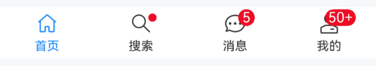
点我查看代码
ts
@Entry
@Component
struct DemoPage {
@State groupId: string = 'tabBar'
@State active: number = 0
build() {
Column(){
IBestTabBar({ groupId: this.groupId, active: $active }){
IBestTabBarItem({ groupId: this.groupId, icon: 'wap-home-o', text: "首页" })
IBestTabBarItem({ groupId: this.groupId, icon: 'search', text: "搜索", dot: true })
IBestTabBarItem({ groupId: this.groupId, icon: 'chat-o', text: "消息", badgeContent: 5 })
IBestTabBarItem({ groupId: this.groupId, icon: 'manager-o', text: "我的", badgeContent: 88, max: 50 })
}
}
}
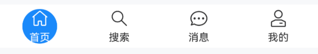
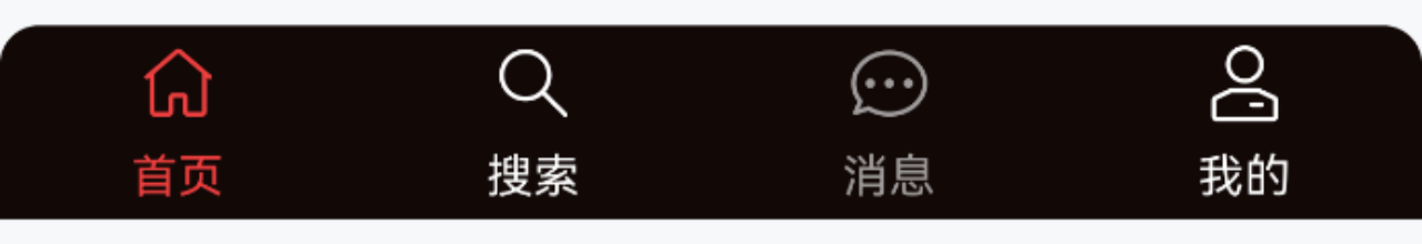
}高亮背景
点我查看代码
ts
@Entry
@Component
struct DemoPage {
  @State groupId: string = 'tabBar'
  @State active: number = 0
  build() {
    Column(){
      IBestTabBar({ groupId: this.groupId, active: $active, highlightType: "bgColor" }){
        IBestTabBarItem({ groupId: this.groupId, icon: 'wap-home-o', text: "首页" })
        IBestTabBarItem({ groupId: this.groupId, icon: 'search', text: "搜索" })
        IBestTabBarItem({ groupId: this.groupId, icon: 'chat-o', text: "消息" })
        IBestTabBarItem({ groupId: this.groupId, icon: 'manager-o', text: "我的" })
      }
    }
  }
}
自定义激活内容
TIP
通过 activeIcon 属性可设置激活状态的图标,activeBuilder 属性可设置激活状态的内容。
点我查看代码
ts
@Entry
@Component
struct DemoPage {
  @State groupId: string = 'tabBar'
  @State active: number = 0
  @Builder customActive(){
    Image($r("app.media.icon_like_o")).width(20)
  }
  build() {
    Column(){
      IBestTabBar({ groupId: this.groupId, active: $active }){
        IBestTabBarItem({
          groupId: this.groupId,
          icon: 'wap-home-o',
          text: "首页",
          activeBuilder: (): void => this.customActive()
        })
        IBestTabBarItem({ groupId: this.groupId, icon: 'search', text: "搜索" })
        IBestTabBarItem({ groupId: this.groupId, icon: 'chat-o', text: "消息", activeIcon: "chat" })
        IBestTabBarItem({ groupId: this.groupId, icon: 'manager-o', text: "我的", activeIcon: "manager" })
      }
    }
  }
}
自定义样式
点我查看代码
ts
@Entry
@Component
struct DemoPage {
@State groupId: string = 'tabBar'
@State active: number = 0
@State show: boolean = true
@State disabled: boolean = true
build() {
Column({space: 14}){
IBestTabBar({
groupId: this.groupId,
active: $active5,
bgColor: "#120907",
inactiveColor: "#fff",
activeColor: "#ed4040",
space: 6,
radius: {topLeft: 10, topRight: 10}
}){
IBestTabBarItem({ groupId: this.groupId, icon: 'wap-home-o', text: "首页" })
IBestTabBarItem({ groupId: this.groupId, icon: 'search', text: "搜索", show: this.show })
IBestTabBarItem({ groupId: this.groupId, icon: 'chat-o', text: "消息", disabled: this.disabled })
IBestTabBarItem({ groupId: this.groupId, icon: 'manager-o', text: "我的" })
}
Row({space: 14}){
IBestButton({
type: "primary",
text: "切换禁用:" + (this.disabled ? "禁用" : "启用"),
onBtnClick: () => {
this.disabled = !this.disabled
}
})
IBestButton({
type: "primary",
text: "切换显示:" + (this.show ? "显示" : "隐藏"),
onBtnClick: () => {
this.show = !this.show
}
})
}
}
}
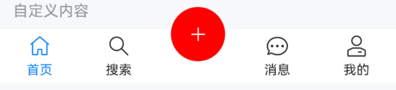
}自定义内容
点我查看代码
ts
@Entry
@Component
struct DemoPage {
@State groupId: string = 'tabBar'
@State active: number = 0
@Builder customBtn(){
Row(){
IBestIcon({
name: "plus",
color: Color.White
})
}
.width(50)
.aspectRatio(1)
.borderRadius(50)
.justifyContent(FlexAlign.Center)
.backgroundColor(Color.Red)
.position({x: '50%', y: -20})
.translate({x: "-50%"})
}
build() {
Column(){
IBestTabBar({ groupId: this.groupId, active: $active }){
IBestTabBarItem({ groupId: this.groupId, icon: 'wap-home-o', text: "首页" })
IBestTabBarItem({ groupId: this.groupId, icon: 'search', text: "搜索" })
IBestTabBarItem({
groupId: this.groupId,
defaultBuilder: (): void => this.customBtn()
})
IBestTabBarItem({ groupId: this.groupId, icon: 'chat-o', text: "消息" })
IBestTabBarItem({ groupId: this.groupId, icon: 'manager-o', text: "我的" })
}
}
}
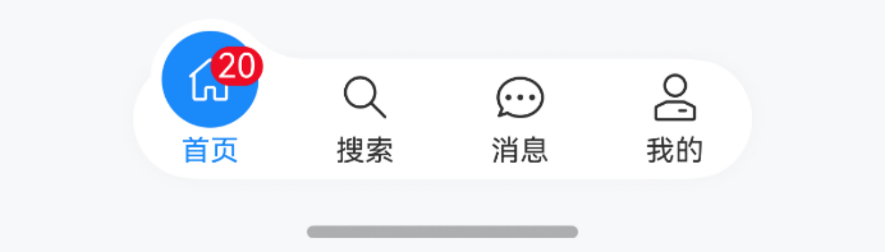
}定位+凸起
点我查看代码
ts
@Entry
@Component
struct DemoPage {
  @State groupId: string = 'tabBar'
  @State active: number = 0
  build() {
    Column(){
      List(){
        // ...
      }
      .width("100%")
      .height("100%")
      IBestTabBar({
        groupId: this.groupId,
        active: $active,
        tabBarWidth: "70%",
        highlightType: "bgColor",
        isConvex: true,
        radius: 60,
        tabBarPosition: {
          left: "15%",
          bottom: 30
        },
        tabBarShadow: {
          radius: 20,
          color: "#f2f3f5"
        }
      }){
        IBestTabBarItem({ groupId: this.groupId, icon: 'wap-home-o', text: "首页", badgeContent: 20 })
        IBestTabBarItem({ groupId: this.groupId, icon: 'search', text: "搜索" })
        IBestTabBarItem({ groupId: this.groupId, icon: 'chat-o', text: "消息" })
        IBestTabBarItem({ groupId: this.groupId, icon: 'manager-o', text: "我的" })
      }
    }
  }
}
API
@Props
| 参数 | 说明 | 类型 | 默认值 |
|---|---|---|---|
| groupId | 分组id, 需保证全局唯一性 | string | number | '' |
| active | 当前选中标签的名称或索引值, 支持双向绑定 | string | number | `` |
| tabBarWidth | 宽度 | string | number | 100% |
| tabBarHeight | 高度 | string | number | 50 |
| tabBarPosition | 定位 | Position | Edges |
| radius | 圆角 | Length | BorderRadiuses | LocalizedBorderRadiuses | 0 |
| bgColor | 背景色, 与背景材质模糊相斥 | ResourceColor | #fff |
| bgBlurStyle | 背景材质模糊, 与背景色相斥, isConvex为true时无效 | BlurStyle | false |
| tabBarShadow | 阴影 | ShadowOptions | ShadowStyle |
| showBorder | 是否显示上边框线 | boolean | false |
| bdColor | 上边框线颜色 | ResourceColor | #ebedf0 |
| highlightType | 高亮类型, 可选值 color、bgColor | string | color |
| isConvex | 高亮背景时是否凸起,仅highlightType为bgColor时有效 | boolean | false |
| activeColor | 选中的颜色 | ResourceColor | #1989fa |
| inactiveColor | 未选中的颜色 | ResourceColor | #323233 |
| iconSize | 图标大小 | string | number | 22 |
| fontSize | 文字大小 | string | number | 12 |
| space | 图标文字间距 | string | number | 4 |
| duration | 切换动画时长,单位ms | number | 200 |
| safeAreaInsetBottom | 是否开启底部安全区适配 | boolean | false |
| beforeChange | 切换标签前的回调函数 | (active: string | number) => boolean | Promise<boolean> | - |
插槽
| 插槽名 | 说明 | 类型 |
|---|---|---|
| defaultBuilder | 默认内容 | CustomBuilder |
Events
| 事件名 | 说明 | 事件类型 |
|---|---|---|
| onChange | 切换后的回调 | (active: string | number) => void |
主题定制
组件提供了下列颜色变量,可用于自定义深色/浅色模式样式,使用方法请参考 颜色模式 章节,如需要其它颜色变量可提 issue。
| 名称 | 描述 | 默认值 |
|---|---|---|
| ibest_tabBar_background | 背景色 | #fff |
| ibest_tabBar_text_color | 未激活的文字颜色 | #323233 |