WeekPicker 周选择
介绍
周选择器,用于选择周,通常与弹出层组件配合使用。
TIP
阅读该组件文档前请确保已认真阅读快速上手章节的每一个字。
引入
ts
import { IBestWeekPicker, IBestPickerOption } from "@ibestservices/ibest-ui";代码演示
基础用法

点我查看代码
ts
import { IBestToast } from "@ibestservices/ibest-ui";
@Entry
@Component
struct DemoPage {
@State selectValue: number = 2
build() {
Column(){
IBestWeekPicker({
title: "选择周",
value: $selectValue,
onConfirm: (value, text) => {
IBestToast.show(value.toString() + " " + text)
},
onChange: (value, text) => {
IBestToast.show(value.toString() + " " + text)
}
})
}
}
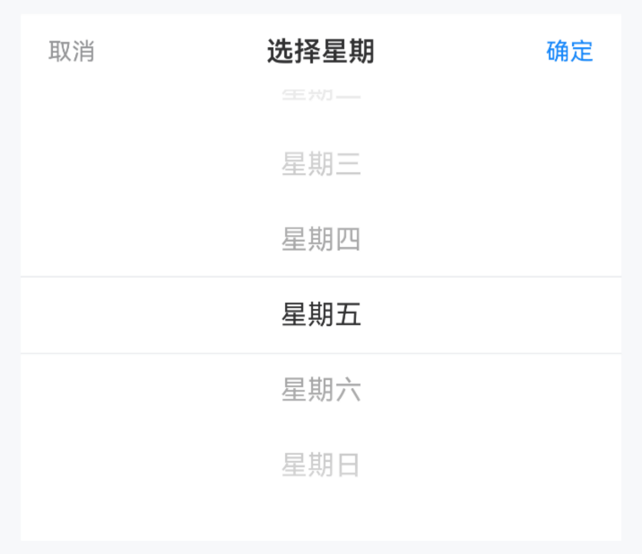
}自定义选项
点我查看代码
ts
import { IBestToast } from "@ibestservices/ibest-ui";
@Entry
@Component
struct DemoPage {
  @State selectValue: string = '5'
  @State options: IBestPickerOption[] = [
    { text: "星期一", value: '1' },
    { text: "星期二", value: '2' },
    { text: "星期三", value: '3' },
    { text: "星期四", value: '4' },
    { text: "星期五", value: '5' },
    { text: "星期六", value: '6' },
    { text: "星期日", value: '7' }
  ]
  build() {
    Column(){
      IBestWeekPicker({
        title: "选择星期",
        value: $selectValue,
        options: this.options,
        onConfirm: (value, text) => {
          IBestToast.show(value.toString() + " " + text)
        },
        onChange: (value, text) => {
          IBestToast.show(value.toString() + " " + text)
        }
      })
    }
  }
}
API
@Props
| 参数 | 说明 | 类型 | 默认值 |
|---|---|---|---|
| value | 已选择的值, 支持双向绑定 | string | number | '' |
| options | 选项列表 | IBestPickerOption[] | [{text: '周一', value: 1},{text: '周二', value: 2},{text: '周三', value: 3},{text: '周四', value: 4},{text: '周五', value: 5},{text: '周六', value: 6},{text: '周日', value: 0}] |
| title | 标题 | ResourceStr | '' |
| itemHeight | 单项高度 | string | number | 44 |
| confirmText | 确认按钮文字 | ResourceStr | 确定 |
| cancelText | 取消按钮文字 | ResourceStr | 取消 |
| showToolBar | 是否显示顶部栏 | boolean | true |
| visibleItemCount | 可见选项数量 | number | 6 |
| horizontal | 是否横向 | boolean | false |
| itemWidth | 单项宽度 | string | number | 44 |
| contentHeight | 整体高度, 仅横向时生效 | string | number | 44 |
| optionFontSize | 未选中字体大小 | string | number | 16 |
| radius | 外部圆角 | string | number | 0 |
| fontColor | 未选中字体颜色 | ResourceColor | #323233 |
| fontWeight | 未选中字体字重 | FontWeight | Normal |
| selectedFontSize | 选中字体大小 | string | number | 16 |
| selectedFontColor | 选中字体颜色 | ResourceColor | #323233 |
| selectedFontWeight | 选中字体字重 | FontWeight | Normal |
Events
| 事件名 | 说明 | 事件类型 |
|---|---|---|
| onChange | 选项变更后触发 | (value: string | numner, text: string) => void |
| onConfirm | 点击确定按钮时触发 | (value: string | numner, text: string) => void |
| onCancel | 点击取消按钮时触发 | () => void |